Visualization:
Code for general neural data plotting (raster plots, multi-channel field potential plots, psth, etc.)
API
Base
- aopy.visualization.base.advance_plot_color(ax, n)[source]
Utility to skip colors for the given axis.
- Parameters:
ax (pyplot.Axes) – specify which axis to advance the color
n (int) – how many colors to skip in the cycle
Examples
Using advance_plot_color to skip the first color in the cycle.
plt.subplots()
aopy.visualization.advance_plot_color(plt.gca(), 1)
plt.plot(np.arange(10), np.arange(10))

- aopy.visualization.base.annotate_spatial_map(elec_pos, text, color, annotation_style='text', fontsize=6, marker='o', markersize=0.25, ax=None, **kwargs)[source]
Add either a text or marker annotation to a 2d position.
- Parameters:
elec_pos ((x,y) tuple) – position where text should be placed on 2d plot
text (str) – annotation text
color (plt.Color) – the color to make the text
annotation_style (str, optional) – style of annotation to use for stimulation site [‘text’, ‘marker’]. Default ‘text’.
fontsize (int, optional) – the fontsize to make the text or marker. Defaults to 6.
marker (str, optional) – marker style for annotations if annotation_style is ‘marker’. Options are the same as pyplot.markers.MarkerStyle; e.g. ‘o’, ‘s’, etc. Default ‘o’.
markersize (float, optional) – size of the marker in data units if annotation_style is ‘marker’. Defaults to 0.25.
ax (pyplot.Axes, optional) – axis on which to plot. Defaults to None.
kwargs (dict) – additional keyword arguments to pass to plt.annotate()
- Returns:
annotation object
- Return type:
plt.Annotation
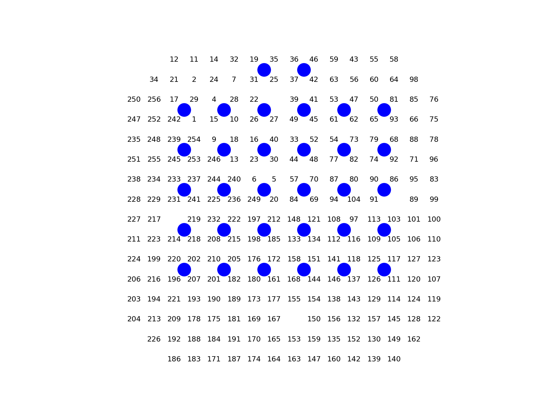
- aopy.visualization.base.annotate_spatial_map_channels(acq_idx=None, acq_ch=None, drive_type='ECoG244', theta=0, color='k', annotation_style='text', fontsize=6, marker='o', markersize=0.25, ax=None, **kwargs)[source]
Given acq_idx (indices) or acq_ch (channel numbers), prints either indices or channel numbers on top of a spatial map.
- Parameters:
acq_idx ((nacq,) array or list, optional) – If provided, specifies the acquisition indices to be annotated. If neither acq_idx nor acq_ch is provided, all channel numbers will be annotated by default.
acq_ch ((nacq,) array or list, optional) – If provided, specifies the acquisition channel numbers to be annotated. If neither acq_idx nor acq_ch is provided, all channel numbers will be annotated by default.
drive_type (str, optional) – Drive type of the channels to plot. See
aopy.data.base.load_chmap().color (str, optional) – color to display the channels. Default ‘k’.
annotation_style (str, optional) – style of annotation to use for stimulation site [‘text’, ‘marker’]. Default ‘text’.
fontsize (int, optional) – the fontsize to make the text or marker. Defaults to 6.
marker (str, optional) – marker style for annotations if annotation_style is ‘marker’. Options are the same as pyplot.markers.MarkerStyle; e.g. ‘o’, ‘s’, etc. Default ‘o’.
markersize (float, optional) – size of the marker in data units if annotation_style is ‘marker’. Defaults to 0.25.
print_zero_index (bool, optional) – if True (the default), prints channel numbers indexed by 0. Otherwise prints directly from the channel map (which should use 1-indexing).
ax (pyplot.Axes, optional) – axis on which to plot. Defaults to None.
kwargs (dict) – additional keyword arguments to pass to plt.annotate()
Example
aopy.visualization.plot_ECoG244_data_map(np.zeros(256,), cmap='Greys')
aopy.visualization.annotate_spatial_map_channels(drive_type='ECoG244', color='k')
aopy.visualization.annotate_spatial_map_channels(drive_type='Opto32', color='b',
                                                 annotation_style='marker')
plt.axis('off')
Note
The acq_ch returned from func::aopy.data.load_chmap are generally 1-indexed lists of acquisition channels connected to electrodes. In python, however, the acquisition indices start at 0, so we give the option to select channels based on either an index (acq_idx) or a channel number (acq_ch).
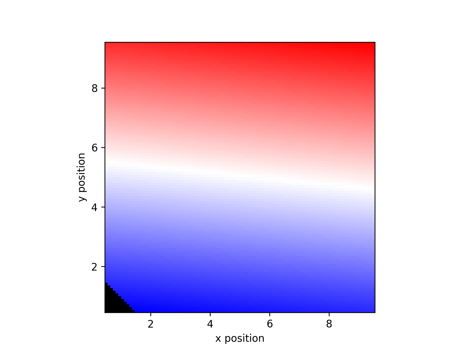
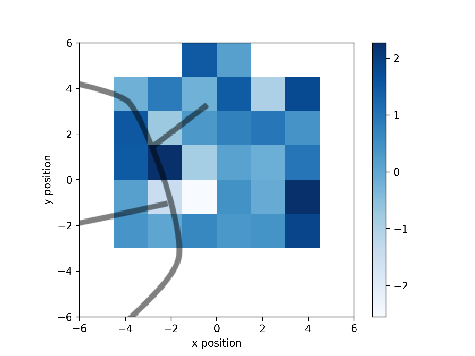
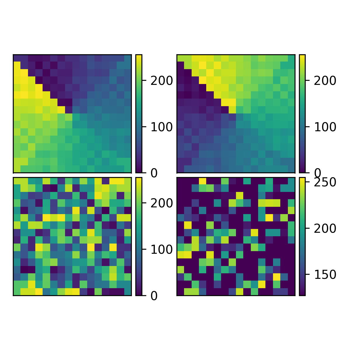
- aopy.visualization.base.calc_data_map(data, x_pos, y_pos, grid_size, interp_method='nearest', threshold_dist=None, extent=None)[source]
Turns scatter data into grid data by interpolating up to a given threshold distance.
- Parameters:
data (nch) – list of values
x_pos (nch) – list of x positions
y_pos (nch) – list of y positions
grid_size (2-tuple) – number of points along each axis (width, height)
interp_method (str) – method used for interpolation
threshold_dist (float) – distance to neighbors before disregarding a point on the image
extent (list) – [xmin, xmax, ymin, ymax] to define the extent of the interpolated grid. Default None, which will use the min and max of the x and y positions.
- Returns:
- tuple containing:
- data_map (grid_size array, e.g. (16,16)): map of the data on the given gridxy (grid_size array, e.g. (16,16)): new grid positions to use with this map
- Return type:
tuple
Example
Make a plot of a 10 x 10 grid of increasing values with some missing data.
data = np.linspace(-1, 1, 100)
x_pos, y_pos = np.meshgrid(np.arange(0.5,10.5),np.arange(0.5, 10.5))
missing = [0, 5, 25]
data_missing = np.delete(data, missing)
x_missing = np.reshape(np.delete(x_pos, missing),-1)
y_missing = np.reshape(np.delete(y_pos, missing),-1)

data_map = get_data_map(data_missing, x_missing, y_missing)
plt.figure()
plot_spatial_map(data_map, x_missing, y_missing)
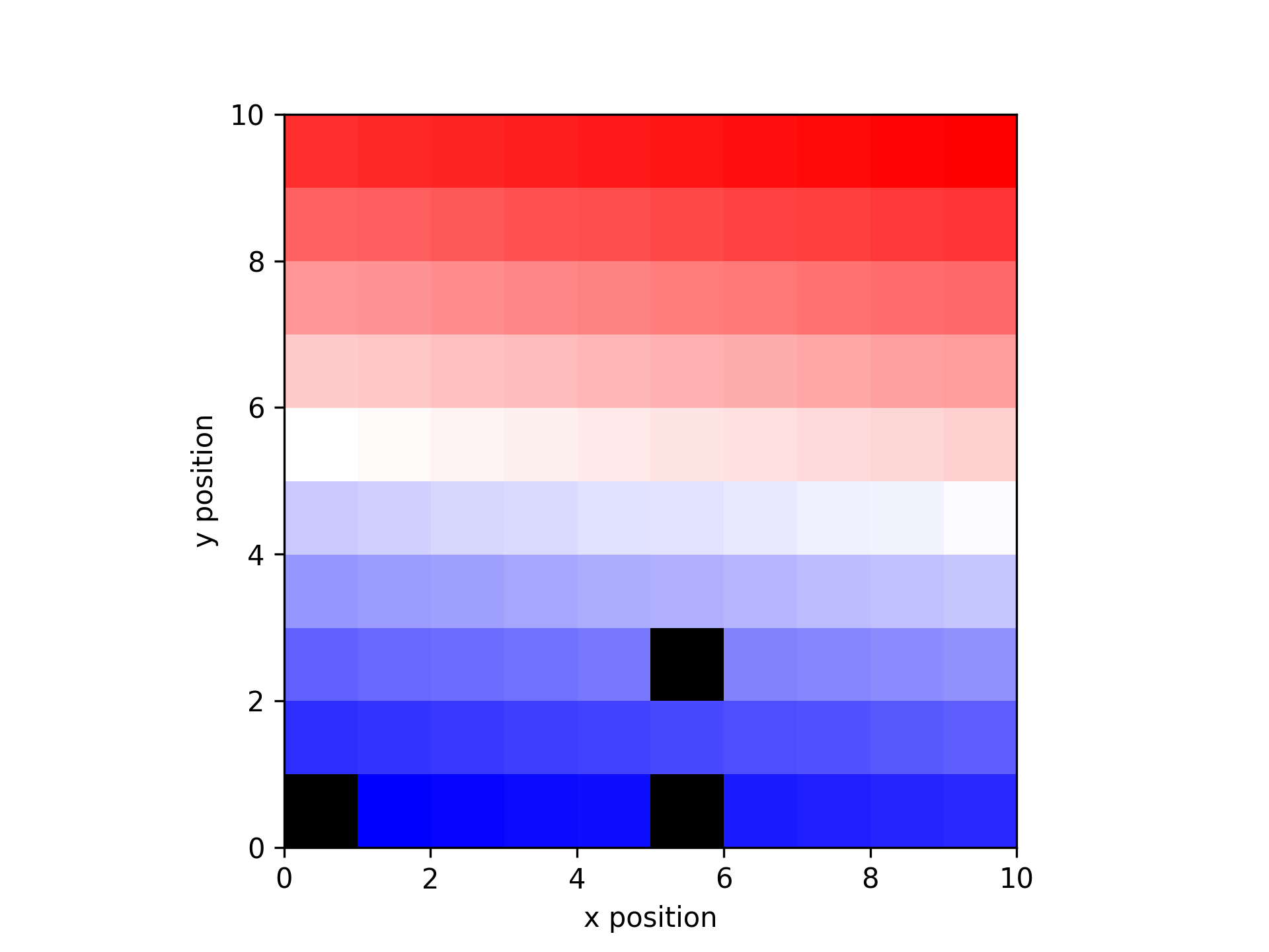
Use calc_data_map to interpolate the missing data
interp_map, xy = calc_data_map(data_missing, x_missing, y_missing, [10, 10], threshold_dist=1.5)
plot_spatial_map(interp_map, xy[0], xy[1])
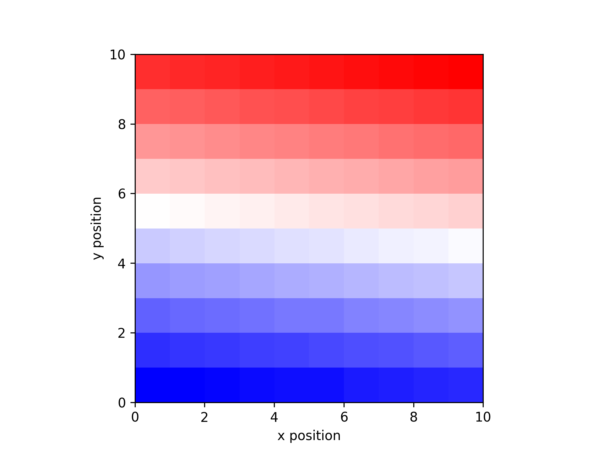
Use cubic interpolation to generate a high resolution map
interp_map, xy = calc_data_map(data_missing, x_missing, y_missing, [100, 100], threshold_dist=1.5,
    interp_method='cubic')
plt.figure()
plot_spatial_map(interp_map, xy[0], xy[1])
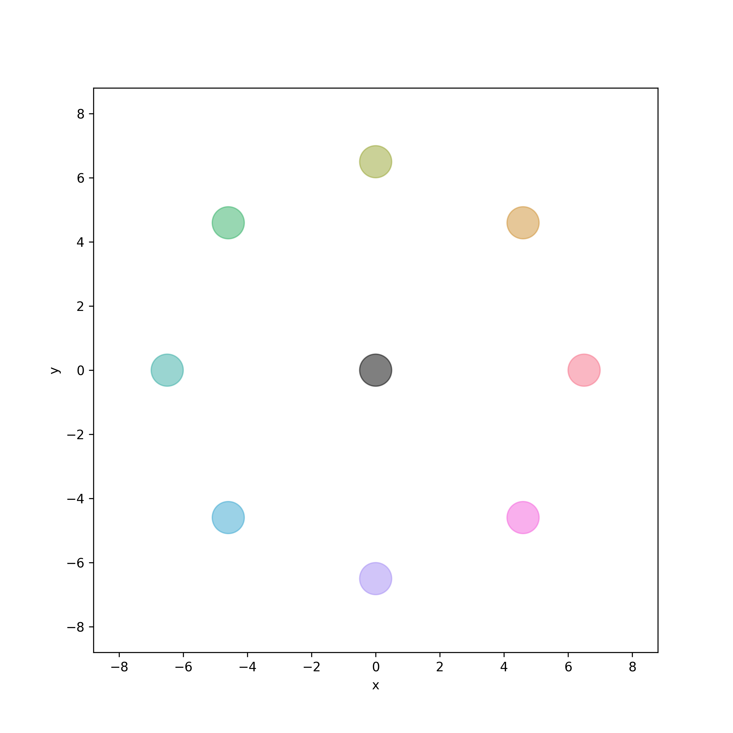
- aopy.visualization.base.color_targets(target_locations, target_idx, colors, target_radius, bounds=None, ax=None, **kwargs)[source]
Color targets according to their index. Useful for visualizing unique targets when trajectories aren’t obviously aligned to specific targets.
- Parameters:
target_locations ((ntargets, 2) or (ntargets, 3) array) – array of target (x, y[, z]) locations
target_idx ((ntargets,) array) – array of indices for each target, used to determine color
colors (list) – list of colors corresponding to each unique index in target_idx
target_radius (float) – radius of the targets in cm
bounds (tuple, optional) – 4- or 6-element tuple describing (-x, x, -y, y[, -z, z]) cursor bounds
ax (plt.Axis, optional) – axis to plot the targets on (2D or 3D)
**kwargs – additional keyword arguments to pass to plot_circles()
Examples
Create and plot eight targets for a center-out task.
angles = np.linspace(0, 2*np.pi, 8, endpoint=False)
radius = 6.5
target_locations = np.column_stack((radius * np.cos(angles), radius * np.sin(angles)))
target_locations = np.vstack(([0, 0], target_locations))
Specify the colors per target index in case they are out of order.
target_idx = [0] + np.arange(1, 9).tolist()  # Center is index 0, peripheral are index 1 through 9
colors = ['black'] + sns.color_palette("husl", 8)
target_radius = 0.5
bounds = (-8, 8, -8, 8)
Use
color_targets()to plot the targetsfig, ax = plt.subplots(figsize=(8, 8)) color_targets(target_locations, target_idx, colors, target_radius, bounds, ax) ax.set_aspect('equal') filename = 'color_targets.png'
- aopy.visualization.base.color_targets_3D(target_locations, target_idx, colors, target_radius=1, resolution=20, alpha=1, bounds=None, ax=None, **kwargs)[source]
Plots multiple targets as spheres in 3D space.
- Parameters:
target_locations (list of tuples or lists) – List of (x, y, z) coordinates specifying the centers of the target spheres.
target_idx ((ntargets,) array) – array of indices for each target, used to determine color.
colors (list of str or None, optional) – List of colors for the targets. If not provided, all targets will default to black. Must match the number of unique targets.
target_radius (float, optional) – Radius of each target sphere. Default is 1.
resolution (int, optional) – Resolution of the spheres (passed to ‘plot_sphere’). Default is 20.
alpha (float, optional) – Transparency of the spheres, where 1 is opaque. Default is 1.
bounds (tuple, optional) – 6-element tuple describing (-x, x, -y, y, -z, z) cursor bounds.
ax (mpl_toolkits.mplot3d.Axes3D, optional) – The Matplotlib 3D axis on which to plot the targets.
Examples
To visualize three targets with different colors and sizes:
import matplotlib.pyplot as plt
from mpl_toolkits.mplot3d import Axes3D
import seaborn as sns

targets = np.array([
    [0., 0., 0.],
    [0., 10., 0.],
    [7.0711, 7.0711, 0.],
    [10., 0., 0.],
    [7.0711, -7.0711, 0.],
    [0., -10., 0.],
    [-7.0711, -7.0711, 0.],
    [-10., 0., 0.],
    [-7.0711, 7.0711, 0.]
])

fig = plt.figure()
ax = fig.add_subplot(111, projection='3d')
ax.set_zlim3d([-10, 10])

colors = sns.color_palette(n_colors=len(targets))
aopy.visualization.color_targets_3D(targets, target_idx=np.arange(len(targets)), target_radius=1, colors=colors, ax=ax)

plt.show()

- aopy.visualization.base.color_trajectories(trajectories, labels, colors, ax=None, **kwargs)[source]
Draws the given trajectories but with the color of each trajectory corresponding to its given label. Works for 2D and 3D axes
Example
trajectories =[
        np.array([
            [0, 0, 0],
            [1, 1, 0],
            [2, 2, 0],
            [3, 3, 0],
            [4, 2, 0]
        ]),
        np.array([
            [-1, 1, 0],
            [-2, 2, 0],
            [-3, 3, 0],
            [-3, 4, 0]
        ])
    ]
labels = [0, 0, 1, 0]
colors = ['r', 'b']
color_trajectories(trajectories, labels, colors)

.. image:: _images/color_trajectories_simple.png

labels_list = [[0, 0, 1, 1, 1], [0, 0, 1, 1], [1, 1, 0, 0]]
fig = plt.figure()
color_trajectories(trajectories, labels_list, colors)

.. image:: _images/color_trajectories_segmented.png
- Parameters:
trajectories (ntrials) – list of (n, 2) or (n, 3) trajectories where n can vary across each trajectory
labels (ntrials) – integer array of labels for each trajectory. Basically an index for each trajectory
colors (ncolors) – list of colors. A list of arrays containing the label for each corresponding trajectory, or a list of lists where each sublist corresponds to the label for each timepoint in the corresponding trajectory.
ax (plt.Axis, optional) – axis to plot the targets on
**kwargs (dict) – other arguments for plot_trajectories(), e.g. bounds
- aopy.visualization.base.combine_channel_figures(figuredir, nch=256, figsize=(6, 5), dpi=150)[source]
Combines all channel figures in directory generated from plot_channel_summary
- Parameters:
figuredir (str) – path to directory of channel profile images
nch (int, optional) – number of channels from data array. Determines combined image layout. Defaults to 256.
figsize (tuple, optional) – (width, height) to pass to pyplot. Default (6, 5)
dpi (int, optional) – resolution to pass to pyplot. Default 150
- aopy.visualization.base.get_color_gradient_RGB(npts, end_color, start_color=[1, 1, 1])[source]
This function outputs an ordered list of RGB colors that are linearly spaced between white and the input color. See also sns.color_palette for a gradient of RGB values within a Seaborn color palette.
Examples
npts = 200
x = np.linspace(0, 2*np.pi, npts)
y = np.sin(x)
fig, ax = plt.subplots()
ax.scatter(x, y, c=get_color_gradient(npts, 'g', [1,0,0]))
- Parameters:
npts (int) – How many different colors are part of the gradient
end_color (str or list) – Color that ends the gradient. Can be any matplotlib color or specific RGB values.
start_color (str or list) – Color that ends the gradient. Can be any matplotlib color or specific RGB values. Defaults to white.
- Returns:
An array with linearly spaced colors from the start to end
- Return type:
(npts, 3)
- aopy.visualization.base.get_data_map(data, x_pos, y_pos)[source]
Organizes data according to the given x and y positions
- Parameters:
data (nch) – list of values
x_pos (nch) – list of x positions
y_pos (nch) – list of y positions
- Returns:
map of the data on the grid defined by x_pos and y_pos
- Return type:
(m,n array)
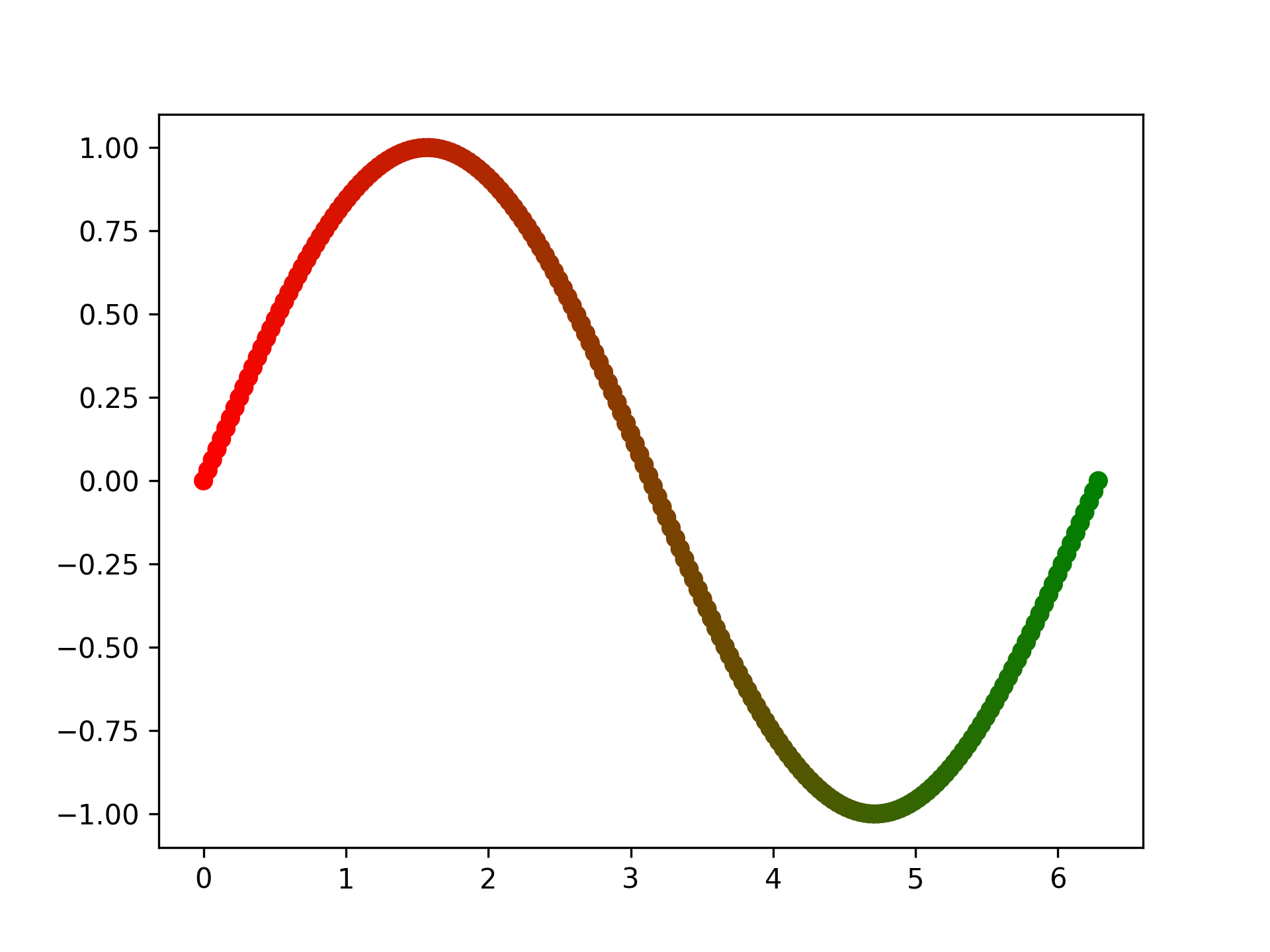
- aopy.visualization.base.gradient_timeseries(data, samplerate, n_colors=100, color_palette='viridis', ax=None, **kwargs)[source]
Draw gradient lines of timeseries data. Default units are seconds and volts.
- Parameters:
data (nt, nch) – timeseries to plot, can be 1d or 2d.
samplerate (float) – sampling rate of the data
n_colors (int, optional) – number of colors in the gradient. Default 100.
color_palette (str, optional) – colormap to use for the gradient. Default ‘viridis’.
ax (plt.Axis, optional) – axis to plot the targets on
kwargs (dict) – keyword arguments to pass to the LineCollection function (similar to plt.plot)
- Raises:
ValueError – if the data has more than 2 dimensions
Example
data = np.reshape(np.sin(np.pi*np.arange(1000)/100), (1000))
samplerate = 1000
gradient_timeseries(data, samplerate)
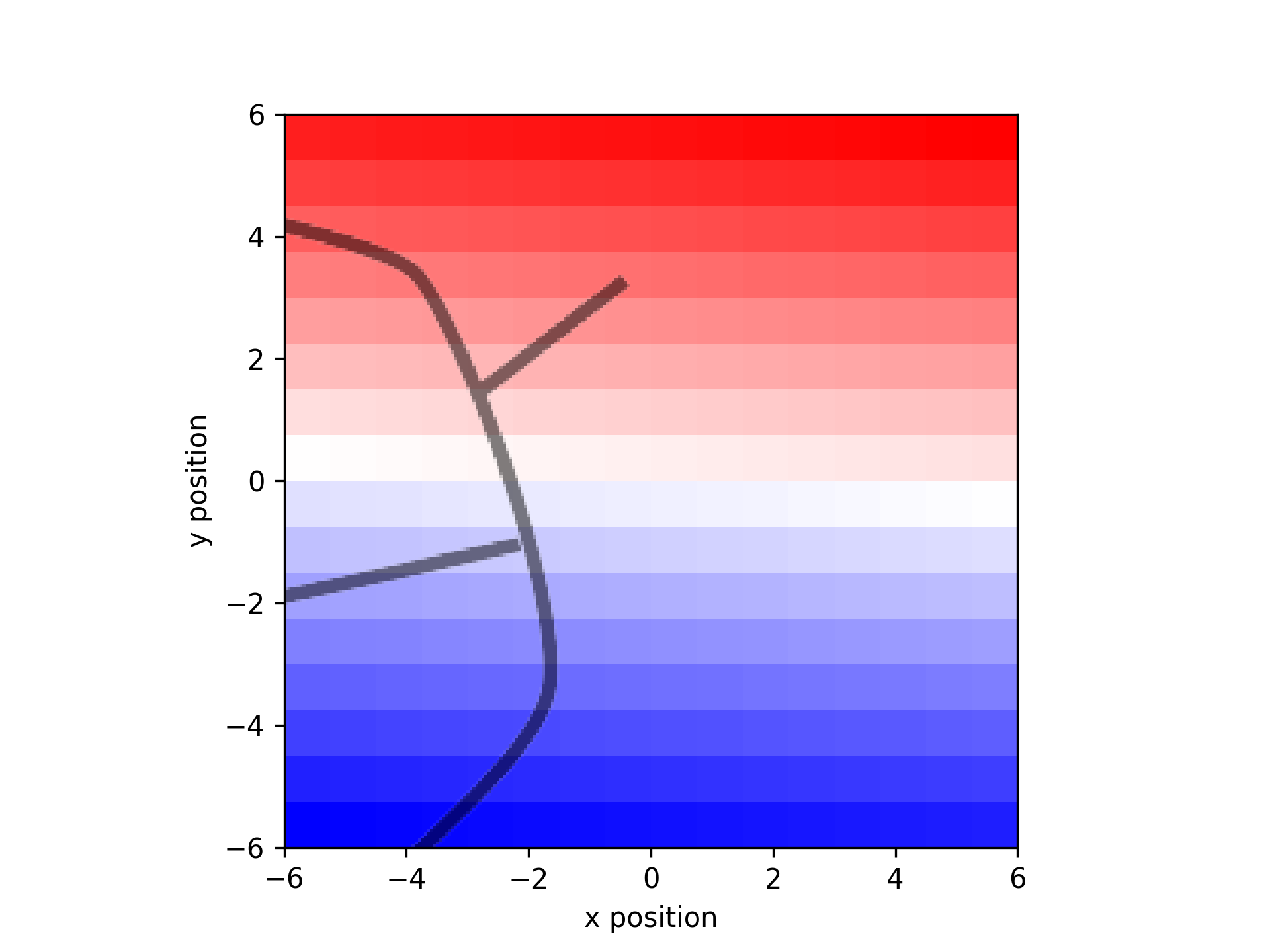
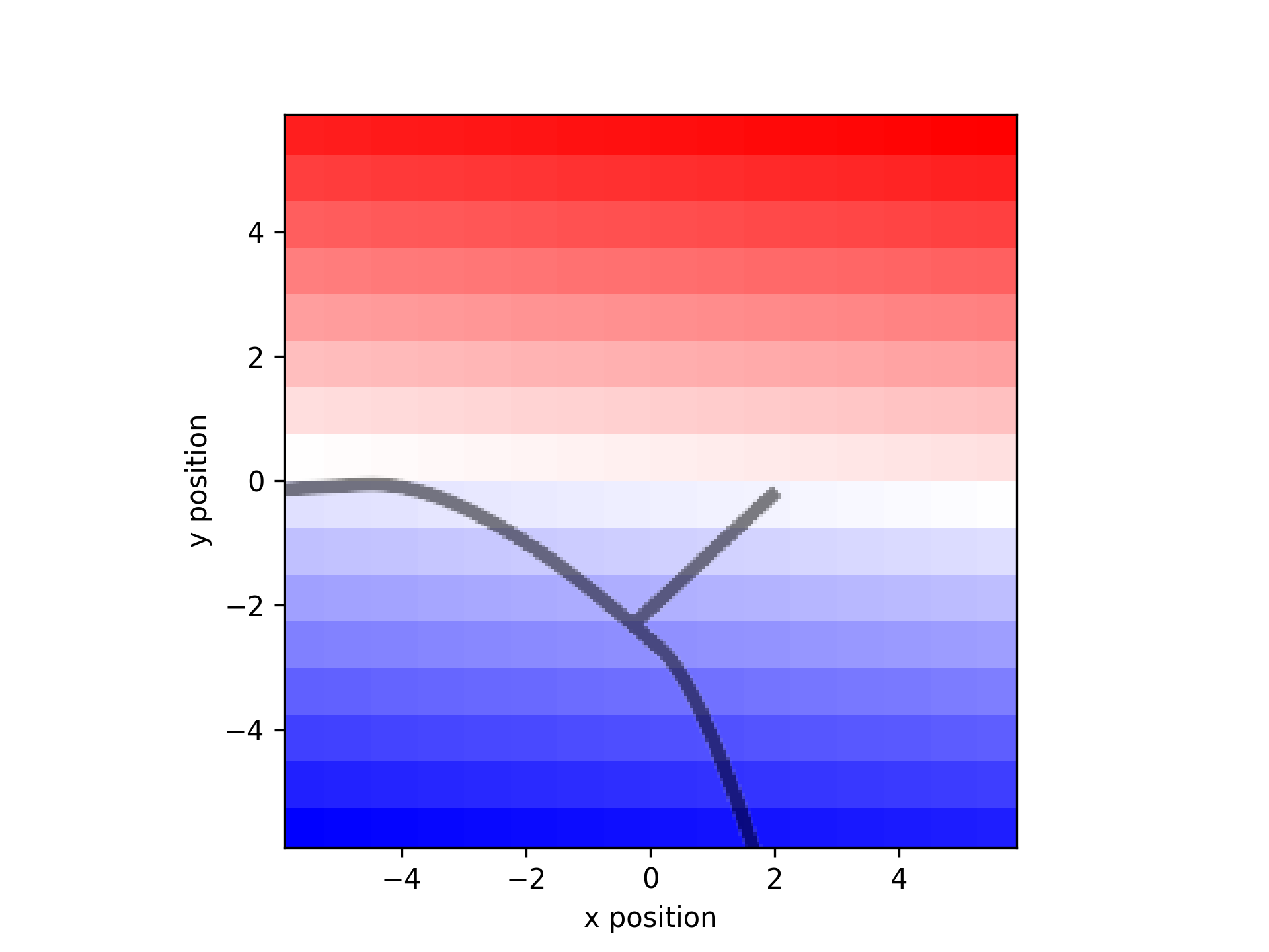
- aopy.visualization.base.gradient_trajectories(trajectories, n_colors=100, color_palette='viridis', bounds=None, ax=None, **kwargs)[source]
Draw trajectories with a gradient of color from start to end of each trajectory. Works in 2D and 3D. If 2D axes are given with 3D data, dimensions of interest are inferred from zero-columns if present. Plotting 3D data with no zero-columns on a 2D axis will show the data in the xy-plane (first two dimensions).
- Note: this function applies the gradient evenly across the timepoints of the trajectory.
It might be useful to use the sampling rate of the data instead of n_colors, so that the time axis is consistent across sampling rates.
- Parameters:
trajectories (ntrials) – list of 2D or 3D trajectories, in x, y[, z] coordinates
n_colors (int, optional) – number of colors in the gradient. Default 100.
color_palette (str, optional) – colormap to use for the gradient. Default ‘viridis’.
bounds (tuple, optional) – 6-element tuple describing (-x, x, -y, y, -z, z) axes bounds
ax (plt.Axis, optional) – axis to plot the targets on
kwargs (dict) – keyword arguments to pass to the LineCollection function (similar to plt.plot)
Example
Cursor trajectories in 2D .. code-block:: python
subject = ‘beignet’ te_id = 5974 date = ‘2022-07-01’ preproc_dir = data_dir traj, _ = aopy.data.get_kinematic_segments(preproc_dir, subject, te_id, date, [32], [81, 82, 83, 239]) gradient_trajectories(traj[:3])
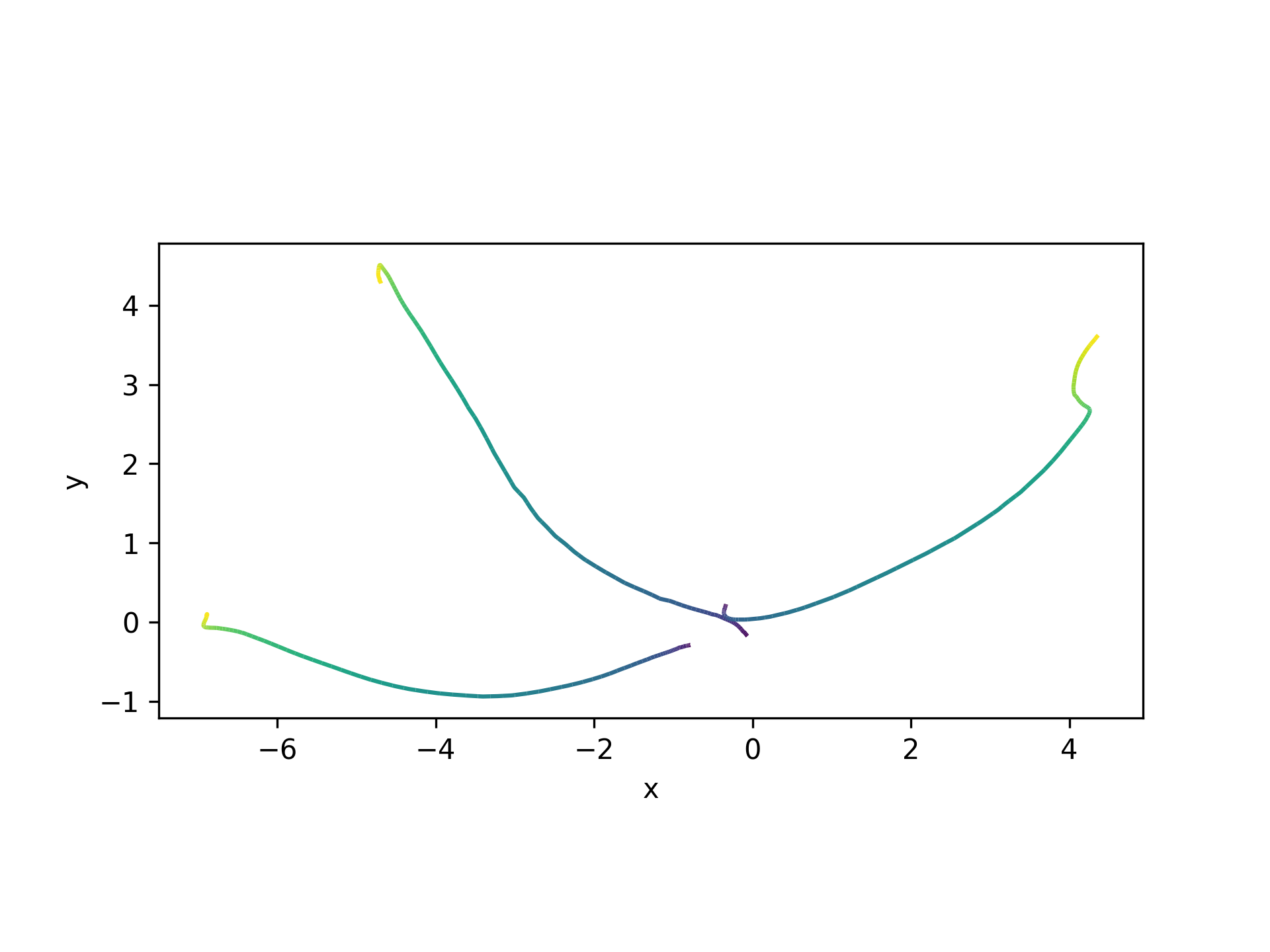
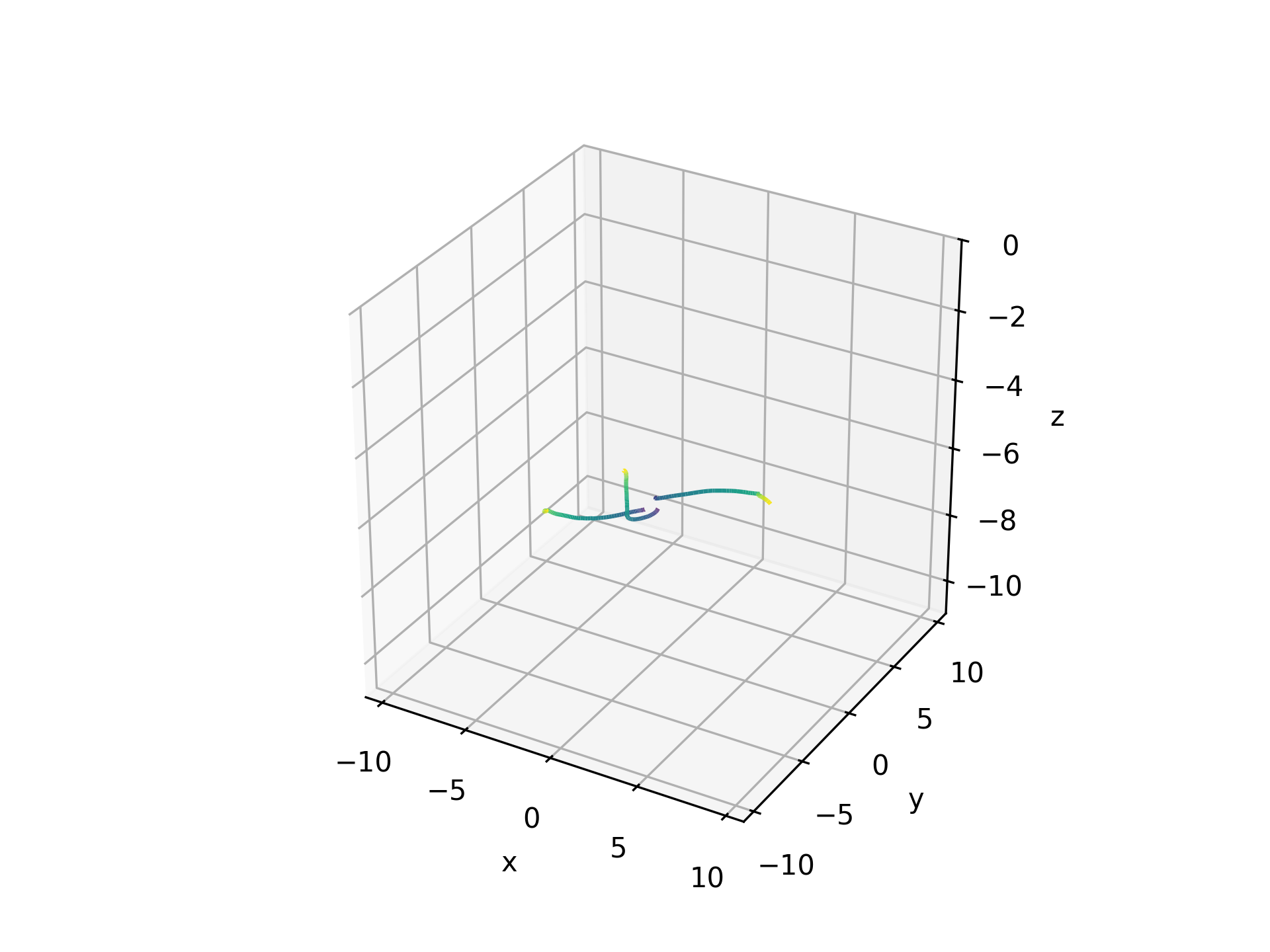
Hand trajectories in 3D .. code-block:: python
traj, _ = aopy.data.get_kinematic_segments(preproc_dir, subject, te_id, date, [32], [81, 82, 83, 239], datatype=’hand’) plt.figure() ax = plt.axes(projection=’3d’) gradient_trajectories(traj[:3], bounds=[-10,0,60,70,20,40], ax=ax)
Note
Automatic bounds aren’t set in 3D plots. The best alternative is to first plot in 2D, then use those bounds to manually set the first 2 axes bounds for the 3D plot.
- aopy.visualization.base.overlay_image_on_spatial_map(filepath, drive_type, theta=0, center=(0, 0), color=None, invert=False, ax=None, **kwargs)[source]
Overlay an image on a spatial map of electrodes. The image is rotated by theta degrees and placed at the same coordinates as electrode positions for the given electrode drive. The image is also optionally inverted and recolored with a single input color.
- Parameters:
filepath (str) – path to the image file
drive_type (str) – drive type to use for the spatial map. See
aopy.data.load_chmap()for options.theta (int, optional) – rotation of the image in degrees. Default is 0.
center (2-tuple) – coordinates where the drive is centered on the brain (in mm). Default (0,0).
color (str, optional) – color to use for the image. Default is None.
invert (bool, optional) – whether to invert the image. Default is False.
ax (pyplot.Axes, optional) – axes on which to plot. Default current axis.
kwargs (dict, optional) – other keyword arguments to pass to ax.imshow, e.g. alpha.
- aopy.visualization.base.overlay_sulci_on_spatial_map(subject, chamber, drive_type, theta=0, center=(0, 0), alpha=0.5, **kwargs)[source]
Overlay a precomputed image of chamber sucli on a spatial map of electrodes. Images are stored in the aopy.config directory. Currently available images are:
Affi LM1 ECoG244
Beignet LM1 ECoG244
- Parameters:
subject (str) – subject name
chamber (str) – chamber type
drive_type (str) – drive type of the spatial map. See
load_chmap()for options.theta (int, optional) – rotation of the image in degrees. Default is 0.
center (2-tuple) – coordinates where the drive is centered on the brain (in mm). Default (0,0).
alpha (float, optional) – transparency of the image. Default is 0.5.
kwargs (dict, optional) – other keyword arguments to pass to ax.imshow, e.g. color.
Examples
elec_pos, acq_ch, elecs = aodata.load_chmap('ECoG244')
plot_spatial_map(np.arange(16*16).reshape((16,16)), elec_pos[:,0], elec_pos[:,1])
overlay_sulci_on_spatial_map('beignet', 'LM1', 'ECoG244')
plot_spatial_map(np.arange(16*16).reshape((16,16)), elec_pos[:,0], elec_pos[:,1])
overlay_sulci_on_spatial_map('affi', 'LM1', 'ECoG244', theta=90)
- aopy.visualization.base.place_Opto32_subplots(fig_size=5, subplot_size=0.75, offset=(0.0, -0.25), theta=0, **kwargs)[source]
Wrapper around place_subplots() for the Opto32 stimulation sites.
- Parameters:
fig_size (float) – width and height (in inches) of the figure
subplot_size (float) – width and height (in inches) of each subplot
offset (tuple) – x and y offset (in inches) from the bottom left corner of the figure
theta (float) – rotation (in degrees) to apply to positions.
kwargs (dict, optional) – other keyword arguments to pass to fig.add_axes
- Returns:
- tuple containing:
- fig (pyplot.Figure): figure where the subplots were placedax (list): pyplot.Axes handles for each stimulation site
- Return type:
tuple
Examples
- aopy.visualization.base.place_subplots(fig, positions, width, height, **kwargs)[source]
Plotting utility to create subplots in arbitrary positions on a figure. Positions are in inches from the bottom left corner of the figure.
- Parameters:
fig (pyplot.Figure) – figure to place the subplots on
positions (npos, 2) – list of (x, y) coordinates (in inches) where to center the subplots
width (float) – width (in inches) of each subplot
height (float) – height (in inches) of each subplot
kwargs (dict, optional) – other keyword arguments to pass to fig.add_axes
- Returns:
pyplot.Axes handles for each position
- Return type:
list
Examples
fig = plt.figure(figsize=(4,6))
positions = [[1, 2], [3, 4]]
width = 1
height = 1
ax = place_subplots(fig, positions, width, height)
ax[0].annotate('1', (0.5,0.5), fontsize=40)
ax[1].annotate('2', (0.5,0.5), fontsize=40)
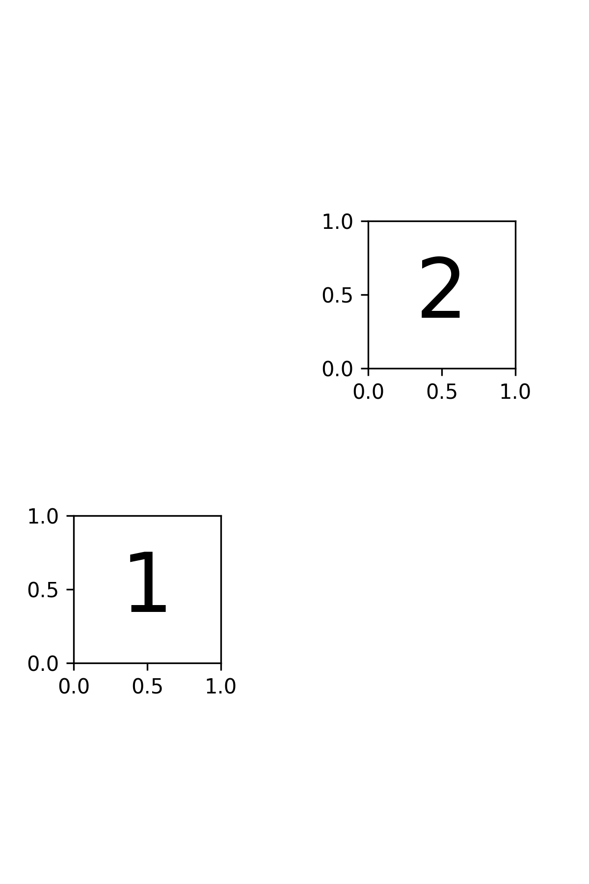
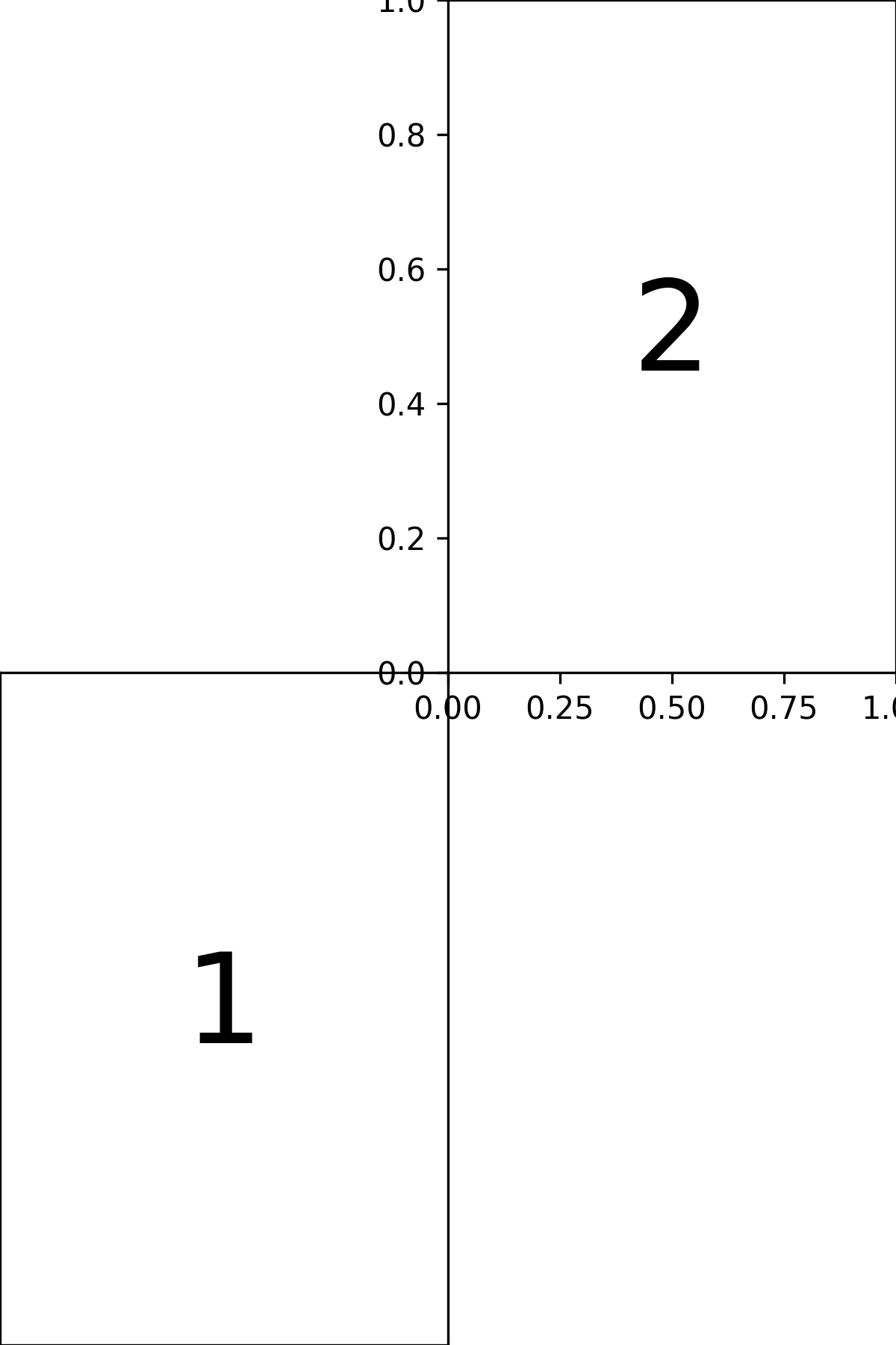
fig = plt.figure(figsize=(4,6))
positions = [[1, 1.5], [3, 4.5]]
width = 2
height = 3
ax = place_subplots(fig, positions, width, height)
ax[0].annotate('1', (0.5,0.5), fontsize=40)
ax[1].annotate('2', (0.5,0.5), fontsize=40)
- aopy.visualization.base.plot_3D_as_2D(trajectories, ax)[source]
Flattens 3D trajectory data to 2D for plotting and sets appropriate axis labels.
This helper function converts a list of 3D trajectories into 2D by identifying and removing one axis. All-zero axes are removed if they exist, otherwise the z-axis is removed. Axis labels are set based on which dimensions are retained.
- Parameters:
trajectories (list of numpy.ndarray) – A list of trajectory arrays, each of shape (T, D), where T is the number of time steps and D is the dimensionality (typically 3).
ax (matplotlib.axes.Axes) – The 2D axis on which the trajectories will be plotted.
- Returns:
An object array of 2D trajectories, each of shape (T, 2), with one axis removed.
- Return type:
numpy.ndarray
Example
traj1 = np.array([[0, 0, 0], [1, 2, 0], [2, 4, 0]]) traj2 = np.array([[0, 0, 0], [1, 1, 0], [2, 2, 0]])
fig, ax = plt.subplots() flat_trajs = plot_3D_as_2D([traj1, traj2], ax)
- for traj in flat_trajs:
ax.plot(traj[:, 0], traj[:, 1])
plt.show()
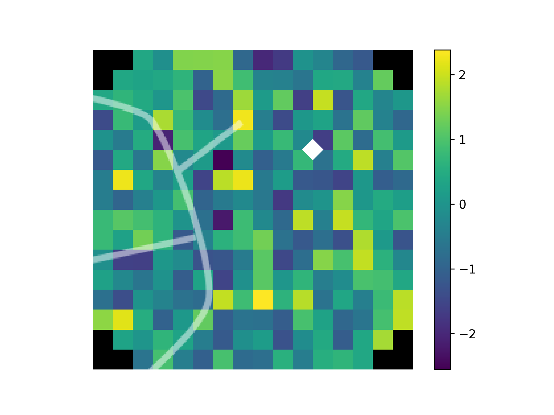
- aopy.visualization.base.plot_ECoG244_data_map(data, elec_data=False, interp=True, cmap='bwr', theta=0, ax=None, **kwargs)[source]
Plot a spatial map of data from an ECoG244 electrode array from the Viventi lab.
- Parameters:
data ((256,) array) – values from the ECoG array to plot in 2D
elec_data (bool, optional) – if True, treat data as electrode data (i.e. nch == nelec), otherwise treat it as acquisition data (nch >= nelec). Defaults to False.
interp (bool, optional) – flag to include 2D interpolation of the result. See
calc_data_map()for options. Defaults to True.cmap (str, optional) – matplotlib colormap to use in image. Defaults to ‘bwr’.
theta (float) – rotation (in degrees) to apply to positions. rotations are applied clockwise, e.g., theta = 90 rotates the map clockwise by 90 degrees, -90 rotates the map anti-clockwise by 90 degrees. Default 0.
ax (pyplot.Axes, optional) – axis on which to plot. Defaults to None.
kwargs (dict) – dictionary of additional keyword argument pairs to send to calc_data_map and plot_spatial_map.
- Returns:
image returned by pyplot.imshow. Use to add colorbar, etc.
- Return type:
pyplot.Image
Updated in v0.9.1 - removed bad_elec argument, added elec_data argument
Examples
data = np.linspace(-1, 1, 256)
missing = [0, 5, 25]
missing_ch = acq_ch[np.isin(elecs, missing)]-1
data[missing_ch] = np.nan

plt.figure()
plot_ECoG244_data_map(data, interp=False, cmap='bwr', ax=None)
# Here the missing electrodes (in addition to the ones
# undefined by the channel mapping) should be visible in the map.

plt.figure()
plot_ECoG244_data_map(data, interp=False, cmap='bwr', ax=None, nan_color=None)
# Now we make the missing electrodes transparent

plt.figure()
plot_ECoG244_data_map(data, interp=True, cmap='bwr', ax=None)
# Missing electrodes should be filled in with linear interp.
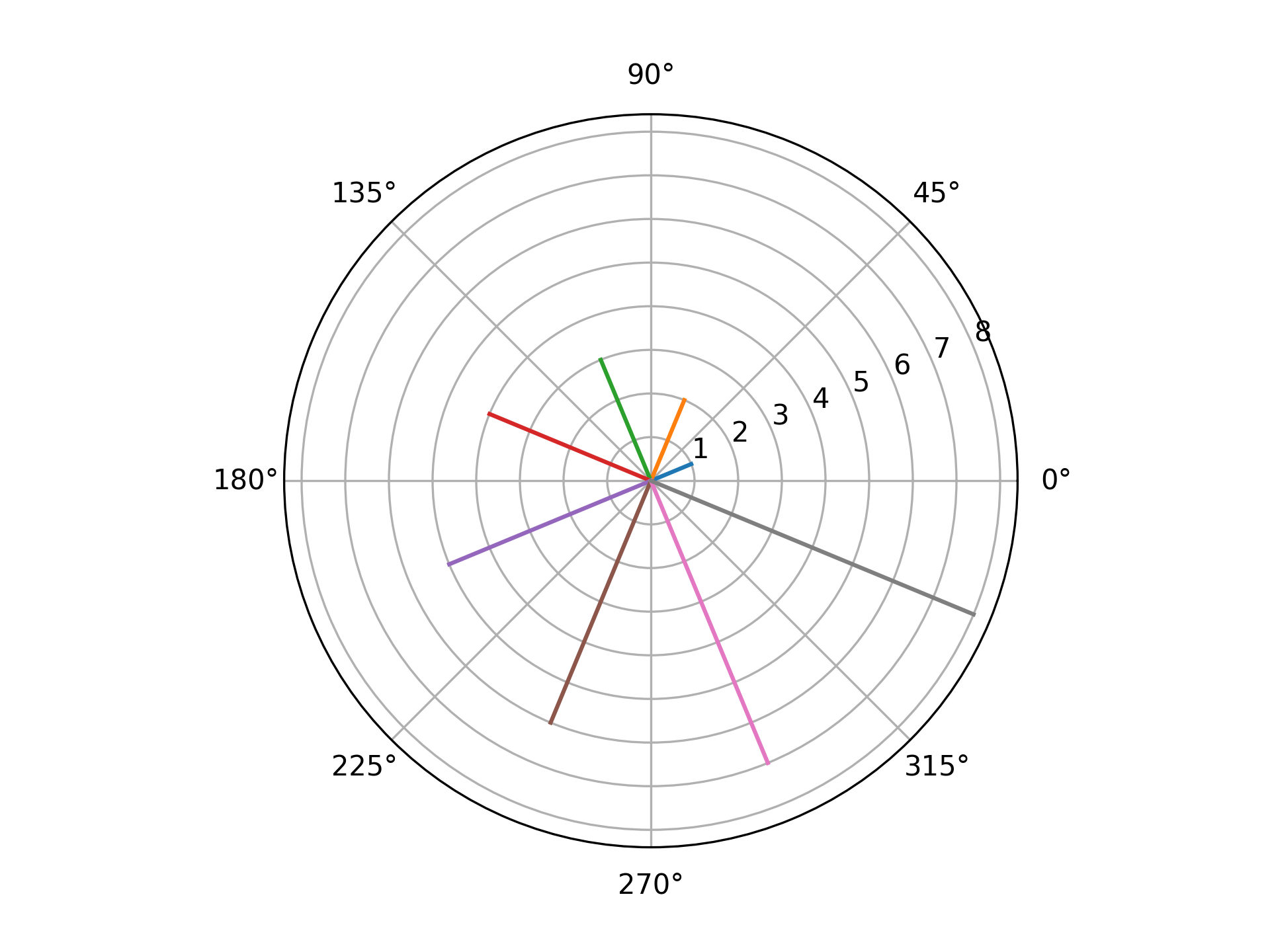
- aopy.visualization.base.plot_angles(angles, magnitudes=None, ax=None, **kwargs)[source]
Polar plot of angles and optional magnitudes. Useful for plotting ITPC or other phase data.
- Parameters:
angles (nt) – array of angles in radians
magnitudes (nt, optional) – array of magnitudes to plot as line lengths
ax (plt.Axis, optional) – axis to plot the targets on (should be a polar plot)
**kwargs – additional keyword arguments to pass to plt.plot
Examples
angles = np.linspace(np.pi/8, 2*np.pi + np.pi/8, 8, endpoint=False)
plot_angles(angles)
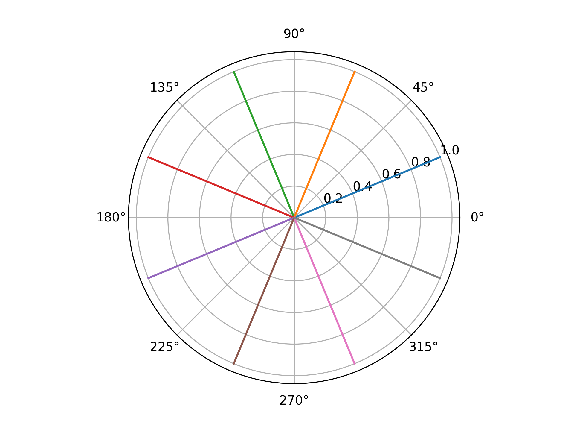
angles = np.linspace(np.pi/8, 2*np.pi + np.pi/8, 8, endpoint=False)
magnitudes = np.arange(len(angles)) + 1

fig, ax = plt.subplots(subplot_kw={'projection': 'polar'})
plot_angles(angles, magnitudes, ax)
- aopy.visualization.base.plot_annotated_spatial_drive_map_stim(data, stim_site, subject, chamber, theta, elec_data=True, interp=True, grid_size=(16, 16), cmap='viridis', clim=None, colorbar=True, annotation_style='marker', fontsize=8, marker='D', markersize=0.5, color='w', recording_drive_type='ECoG244', stim_drive_type='Opto32', ax=None, **kwargs)[source]
Stimulation-specific version of
plot_spatial_drive_map()that includes annotations for the stimulation site, removes tick marks, despines the map, and adds an overlay of the stimulation channel and chamber sulci locations.- Parameters:
data (nch) – data to plot
stim_site (int) – stimulation site to annotate on the map
subject (str) – subject name
chamber (str) – chamber type (e.g. ‘LM1’)
theta (int) – rotation of the chamber in degrees
elec_data (bool, optional) – whether to treat data as per electrode (True) or per acquistion channel (False). Default True.
interp (bool, optional) – whether to interpolate the data onto a grid. See
calc_data_map()for options. Defaults to True.grid_size (tuple, optional) – size of the grid to interpolate. Default (16, 16)
cmap (str, optional) – colormap to use for plotting. Default ‘viridis’.
clim (tuple, optional) – 2-tuple of color limits (min, max) for the plot. Default None.
colorbar (bool, optional) – whether to add a colorbar to the plot. Default True
annotation_style (str, optional) – style of annotation to use for stimulation site [‘text’, ‘marker’]. Default ‘marker’.
fontsize (int, optional) – the fontsize to make the text or marker. Defaults to 8.
marker (str, optional) – marker style for annotations if annotation_style is ‘marker’. Options are the same as pyplot.markers.MarkerStyle; e.g. ‘o’, ‘s’, etc. Default ‘D’.
markersize (float, optional) – size of the marker in data units for annotations if annotation_style is ‘marker’. Default 0.5.
color (str, optional) – color for annotations. Default ‘w’
recording_drive_type (str, optional) – drive type of the recording. Default ‘ECoG244’. See
aopy.data.load_chmap()for options.stim_drive_type (str, optional) – drive type of the stimulation. Default ‘Opto32’. See
aopy.data.load_chmap()for options.ax (pyplot.Axes, optional) – axes on which to plot. Default current axis.
kwargs (dict, optional) – other keyword arguments to pass to
plot_spatial_drive_map()
- Returns:
- tuple containing:
im (pyplot.Image): image object returned from pyplot.imshow. Useful for adding colorbars, etc.
pcm (pyplot.Colorbar): colorbar object if colorbar is True, otherwise None
- Return type:
tuple
Examples
data = np.random.normal(0, 1, (240,))
stim_site = 7
plot_annotated_spatial_drive_map_stim(data, stim_site, 'beignet', 'lm1', 0, interp_method='cubic')
- aopy.visualization.base.plot_annotated_stim_drive_data(data, subject, chamber, theta, interp=False, stim_drive_type='Opto32', recording_drive_type='ECoG244', cmap='Blues', colorbar=True, color='k', nan_color='white', ax=None, **kwargs)[source]
Plot a spatial map of data for each stimulation site in a drive with the bounds and sulci overlayed of a recording drive shown for reference.
- Parameters:
data (nch) – data to plot
subject (str) – subject name
chamber (str) – chamber type (e.g. ‘LM1’)
theta (int) – rotation of the chamber in degrees
interp (bool, optional) – whether to interpolate the data onto a grid. See
calc_data_map()for options. Defaults to False.stim_drive_type (str) – drive type of the stimulation data. Default ‘Opto32’. See
aopy.data.load_chmap()for options.recording_drive_type (str) – drive type of the recording used in the chamber. Default ‘ECoG244’. See
aopy.data.load_chmap()for options.cmap (str) – colormap to use for plotting
colorbar (bool, optional) – whether to add a colorbar to the plot. Default True
color (str) – color for annotations. Default ‘k’
nan_color (str) – color to use for NaN values. Default ‘white’
ax (pyplot.Axes, optional) – axes on which to plot. Default current axis.
kwargs (dict, optional) – other keyword arguments to pass to
plot_spatial_drive_map()
- Returns:
- tuple containing:
im (pyplot.Image): image object returned from pyplot.imshow. Useful for adding colorbars, etc.
pcm (pyplot.Colorbar): colorbar object if colorbar is True, otherwise None
- Return type:
tuple
Examples
data = np.random.normal(0, 1, (32,))
plot_annotated_stim_drive_data(data, 'beignet', 'lm1', 0)
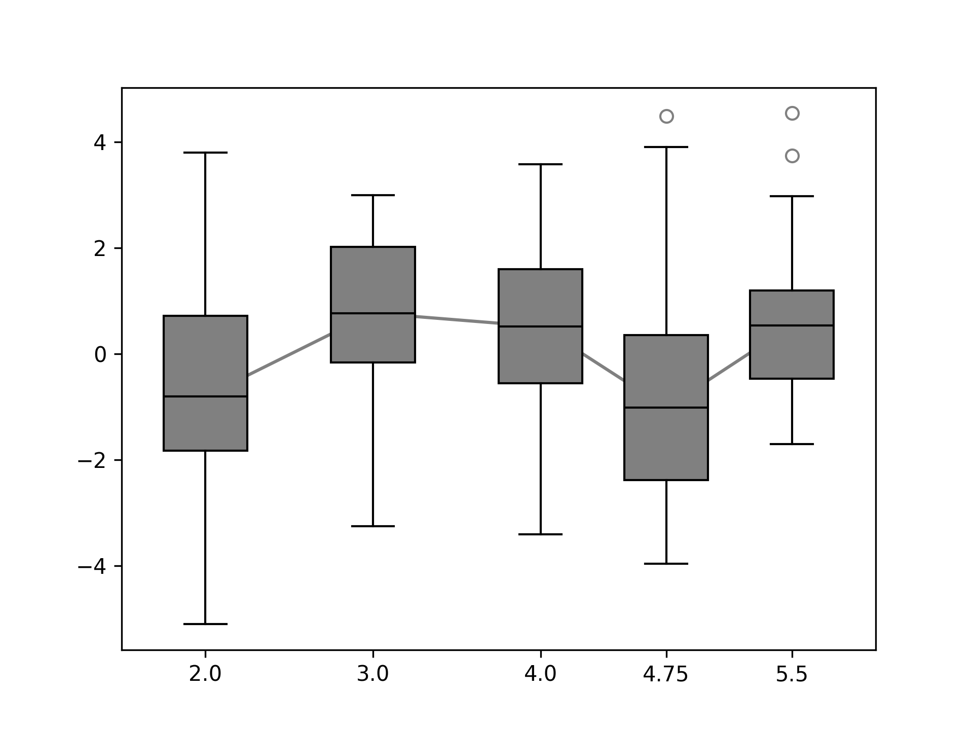
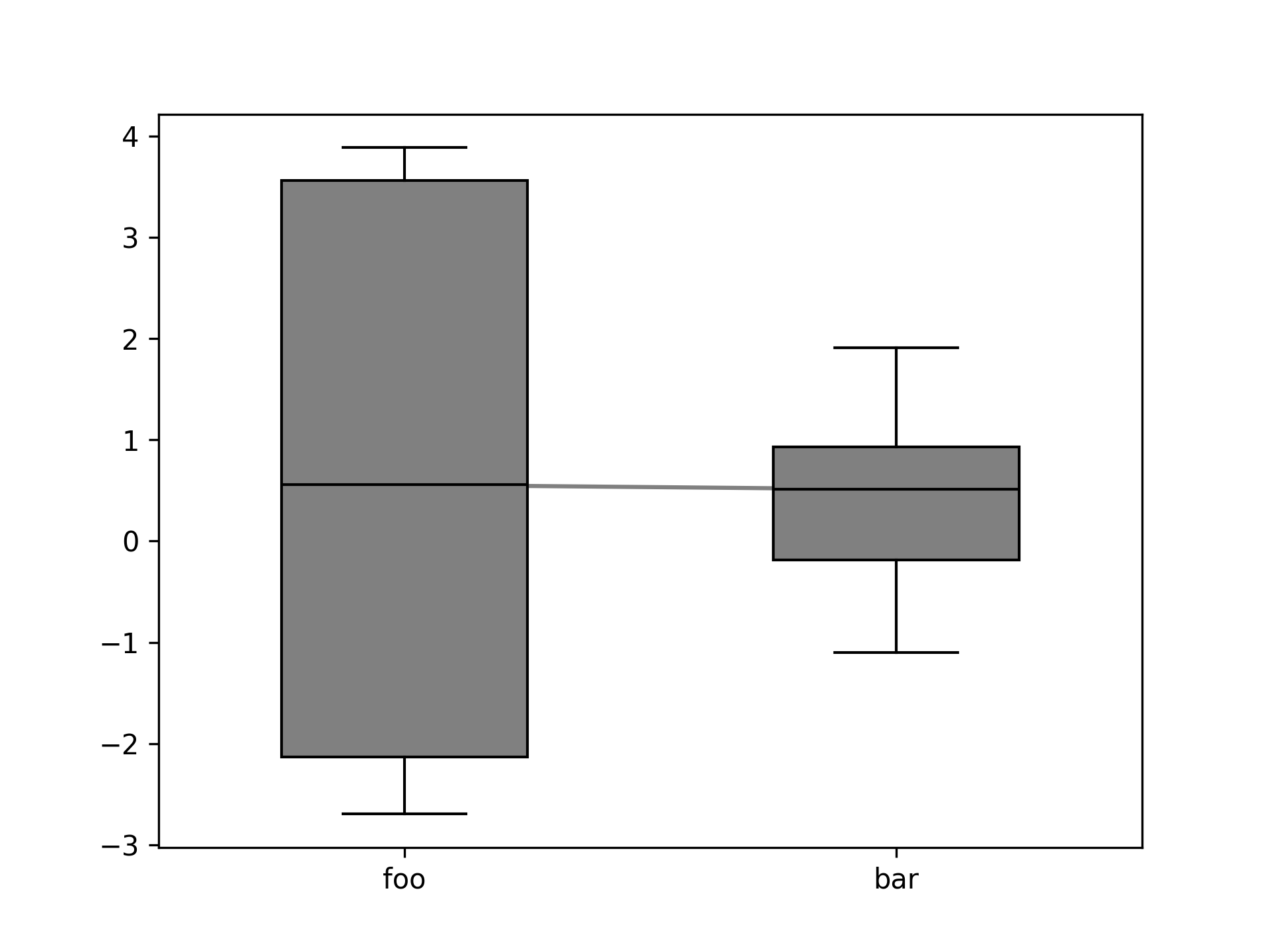
- aopy.visualization.base.plot_boxplots(data, plt_xaxis, trendline=True, facecolor='gray', linecolor='k', box_width=0.5, label_xticks=True, ax=None)[source]
This function creates a boxplot for each column of input data. If the input data has NaNs, they are ignored.
- Parameters:
data (ncol list or (m, ncol) array) – Data to plot. A different boxplot is created for each entry of the list.
plt_xaxis (ncol) – X-axis locations or labels to plot the boxplot of each column
trendline (bool) – If a line should be used to connect boxplots
facecolor (color) – Color of the box faces. Can be any input that pyplot interprets as a color.
linecolor (color) – Color of the connecting lines.
label_xticks (bool) – If the values of ‘plt_xaxis’ should be used to label the xticks. If multiple boxplots are plotted on the same figure this should be set to False.
ax (axes handle) – Axes to plot
Examples
Using a rectangular array and numeric x-axis points.
data = np.random.normal(0, 2, size=(20, 5))
xaxis_pts = np.array([2,3,4,4.75,5.5])
fig, ax = plt.subplots(1,1)
plot_boxplots(data, xaxis_pts, ax=ax)
Using a list of nonrectangular arrays with categorical x-axis points.
data = [np.random.normal(0, 2, size=(10)), np.random.normal(0, 1, size=(20))]
xaxis_pts = ['foo', 'bar']
fig, ax = plt.subplots(1,1)
plot_boxplots(data, xaxis_pts, ax=ax)
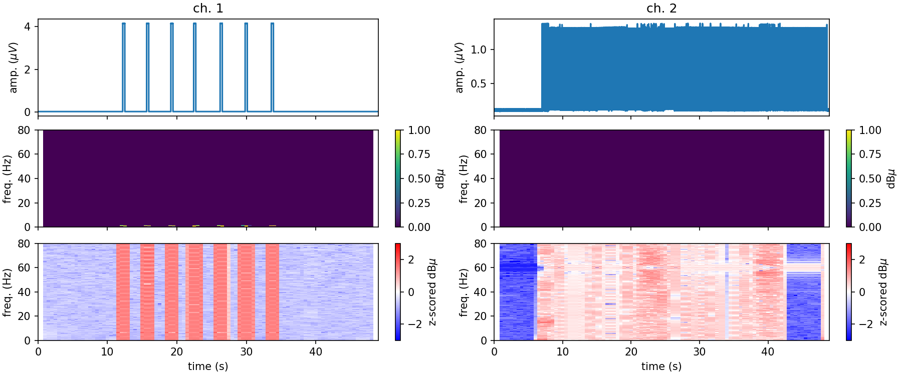
- aopy.visualization.base.plot_channel_summary(chdata, samplerate, nperseg=None, noverlap=None, trange=None, title=None, figsize=(6, 5), dpi=150, frange=(0, 80), cmap_lim=(0, 40))[source]
Plot time domain trace, spectrogram and normalized (z-scored) spectrogram. Computes spectrogram.
---------------
| time series |
|-------------|
| spectrogram |
|-------------|
| norm sgram  |
---------------
- Parameters:
chdata (nt,1) – neural recording data from a given channel (lfp, ecog, broadband)
samplerate (int) – data sampling rate
nperseg (int) – length of each spectrogram window (in samples)
noverlap (int) – number of samples shared between neighboring spectrogram windows (in samples)
trange (tuple, optional) – (min, max) time range to display. Default show the entire time series
title (str, optional) – print a title above the timeseries data. Default None
figsize (tuple, optional) – (width, height) to pass to pyplot. Default (6, 5)
dpi (int, optional) – resolution to pass to pyplot. Default 150
frange (tuple, optional) – range of frequencies to display in spectrogram. Default (0, 80)
cmap_lim (tuple, optional) – clim to display in the spectrogram. Default (0, 40)
- Outputs:
fig (Figure): Figure object
- aopy.visualization.base.plot_circles(circle_positions, circle_radius, circle_color='b', bounds=None, alpha=0.5, ax=None, unique_only=True)[source]
Add circles to an axis. Works for 2D and 3D axes
- Parameters:
circle_positions (ntarg, 3) – array of target (x, y, z) locations
circle_radius (float) – radius of each target
circle_color (str) – color to draw circle - default is blue
bounds (tuple, optional) – 6-element tuple describing (-x, x, -y, y, -z, z) cursor bounds
origin (tuple, optional) – (x, y, z) position of the origin
ax (plt.Axis, optional) – axis to plot the targets on
unique_only (bool, optional) – If True, function will only plot targets with unique positions (default: True)
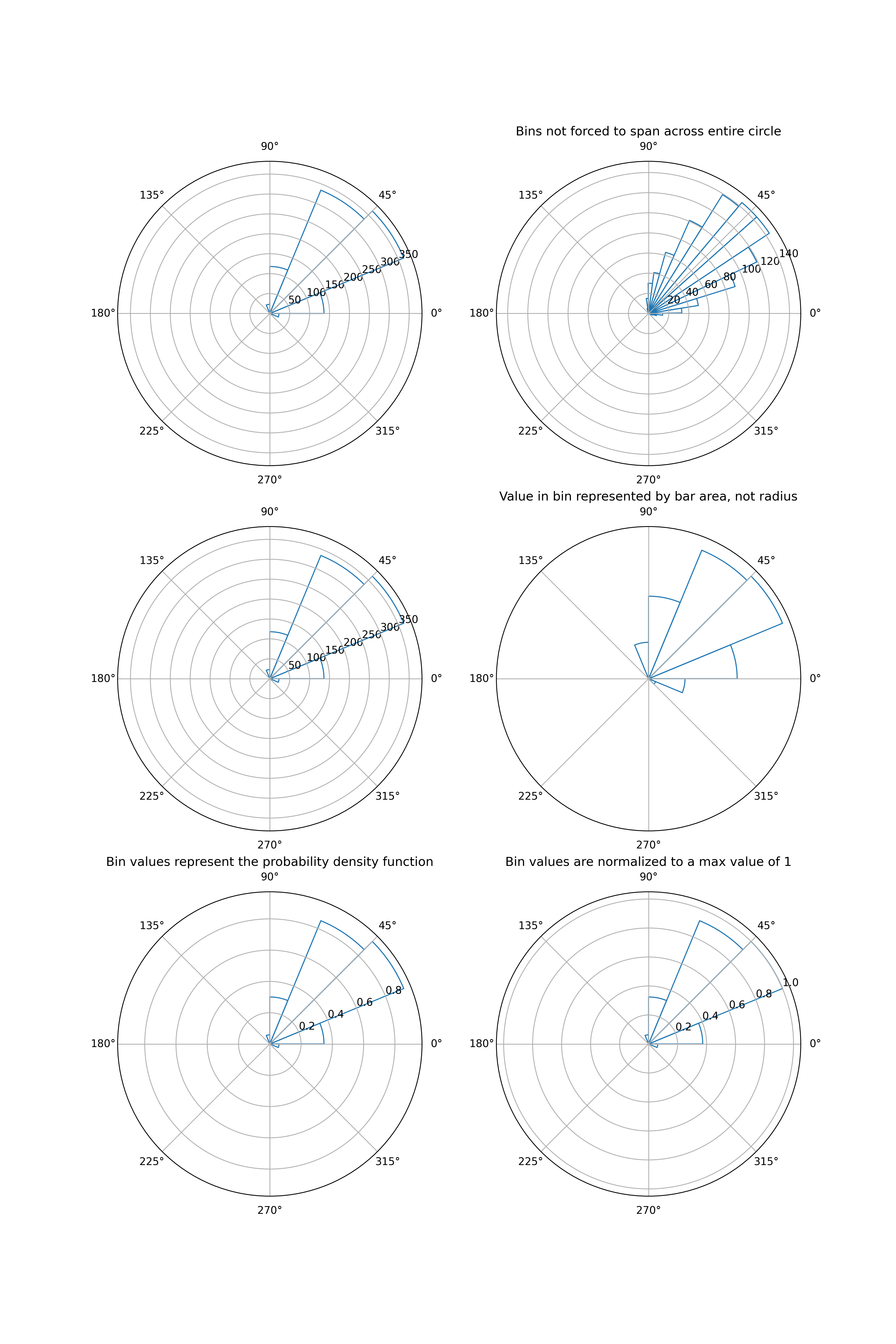
- aopy.visualization.base.plot_circular_hist(data, bins=16, density=False, offset=0, proportional_area=False, gaps=False, normalize=False, ax=None, **kwargs)[source]
- Plot a circular histogram of angles on a given ax. Adapted from:
https://stackoverflow.com/questions/22562364/circular-polar-histogram-in-python.
- Parameters:
data (arr) – angles to plot, in radians.
bins (int, optional) – defines the number of equal-width bins in the range. Default is 16.
density (bool, optional) – whether to return the probability density function at each bin, instead of the number of samples (passed to np.histogram). Default is False.
offset (float, optional) – the offset for the location of the 0 direction, in radians. Default is 0.
proportional_area (bool, optional) – If True, plots bars proportional to area. If False, plots bars proportional to radius. Default is False.
gaps (bool, optional) – whether to allow gaps between bins. If True, the bins will only span the values of the data. If False, the bins are forced to partition the entire [-pi, pi] range. Default is False.
normalize (bool, optional) – whether to normalize the bin values such that the max value is 1. Default is False.
ax (pyplot.Axes, optional) – axes on which to plot. Should be an axis instance created with subplot_kw=dict(projection=’polar’). Default current axis.
kwargs (dict, optional) – other keyword arguments to pass to ax.bar
- Returns:
the number of values in each bin bins (arr): the edges of the bins patches (.BarContainer or list of a single .Polygon): container of individual artists used to create the histogram
or list of such containers if there are multiple input datasets
- Return type:
n (arr or list of arr)
Examples
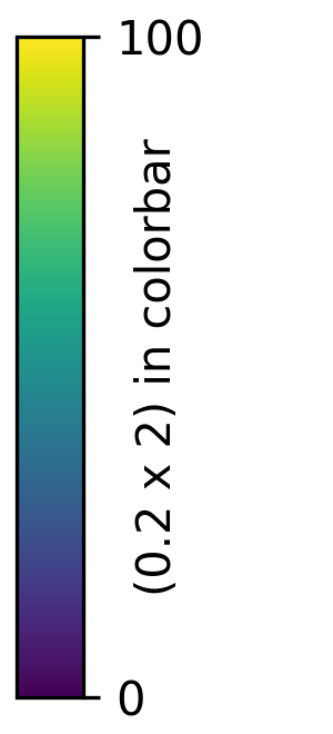
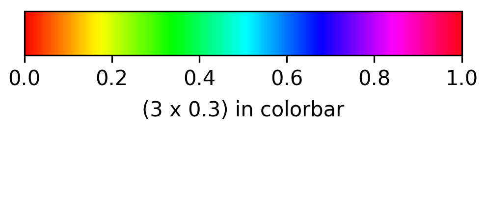
- aopy.visualization.base.plot_colorbar(size, cmap, clim=(0, 1), orientation='vertical', ticks=None, label=None, labelpad=5, **kwargs)[source]
Plot just a colorbar in its own figure for the given colormap and color limits.
- Parameters:
size (2-tuple) – (width, height) of the colorbar in inches
cmap (str or Colormap) – colormap to use
clim (2-tuple, optional) – color limits to use. Default (0,1)
orientation (str, optional) – ‘vertical’ or ‘horizontal’. Default ‘vertical’
ax (pyplot.Axis, optional) – axis to plot the colorbar on. Default None, which will use gca.
kwargs (dict, optional) – additional keyword arguments to pass to plt.colorbar()
- Returns:
the created colorbar object
- Return type:
Colorbar
Examples
aopy.visualization.plot_colorbar(
    size=(0.2,2),
    cmap='viridis',
    clim=(0, 100),
    ticks=[0,100],
    orientation='vertical',
    label='(0.2 x 2) in colorbar',
    labelpad=-15,
)
aopy.visualization.plot_colorbar(
    size=(3,0.3),
    cmap='hsv',
    clim=(0, 1),
    orientation='horizontal',
    label='(3 x 0.3) in colorbar'
)
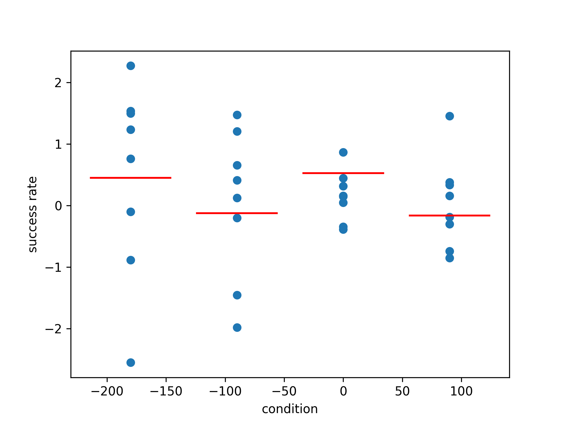
- aopy.visualization.base.plot_condition_tuning(per_condition_data, conditions, ylabel='success rate', ax=None, **kwargs)[source]
Plot tuning curves for categorical data. Essentially a scatter plot with the mean of each condition plotted as a solid line.
- Parameters:
per_condition_data (nconditions, ...) – data for each condition
conditions (nconditions) – condition for each data point
ylabel (str, optional) – label for the y-axis. Default “success rate”
ax (pyplot.Axes, optional) – axis to plot the tuning curves on. Default the current axis.
Examples
Plot the success rate for 4 different conditions
- aopy.visualization.base.plot_corr_across_entries(preproc_dir, subjects, ids, dates, band=(70, 200), taper_len=0.1, num_seconds=60, cmap='viridis', ax=None, remove_bad_ch=True, **bad_ch_kwargs)[source]
Plot the correlation vs electrode distance for each entry in the given list of subjects, ids, and dates.
- Parameters:
preproc_dir (str) – path to the preprocessed data directory
subjects (list) – list of subject names
ids (list) – list of te_ids
dates (list) – list of dates
band (tuple, optional) – frequency band to filter the data. Default (70, 200)
taper_len (float, optional) – length of taper to use in the filter. Default 0.1
num_seconds (int, optional) – number of seconds to use in the correlation calculation. Default 60
cmap (str, optional) – colormap to use for plotting. Default ‘viridis’
ax (pyplot.Axes, optional) – axis on which to plot. Default current axis
remove_bad_ch (bool, optional) – whether to remove bad channels from the data. Default True
bad_ch_kwargs (dict, optional) – keyword arguments to pass to :func:`a
Example
Plotting the correlation vs electrode distance for a few entries in the preprocessed data directory.
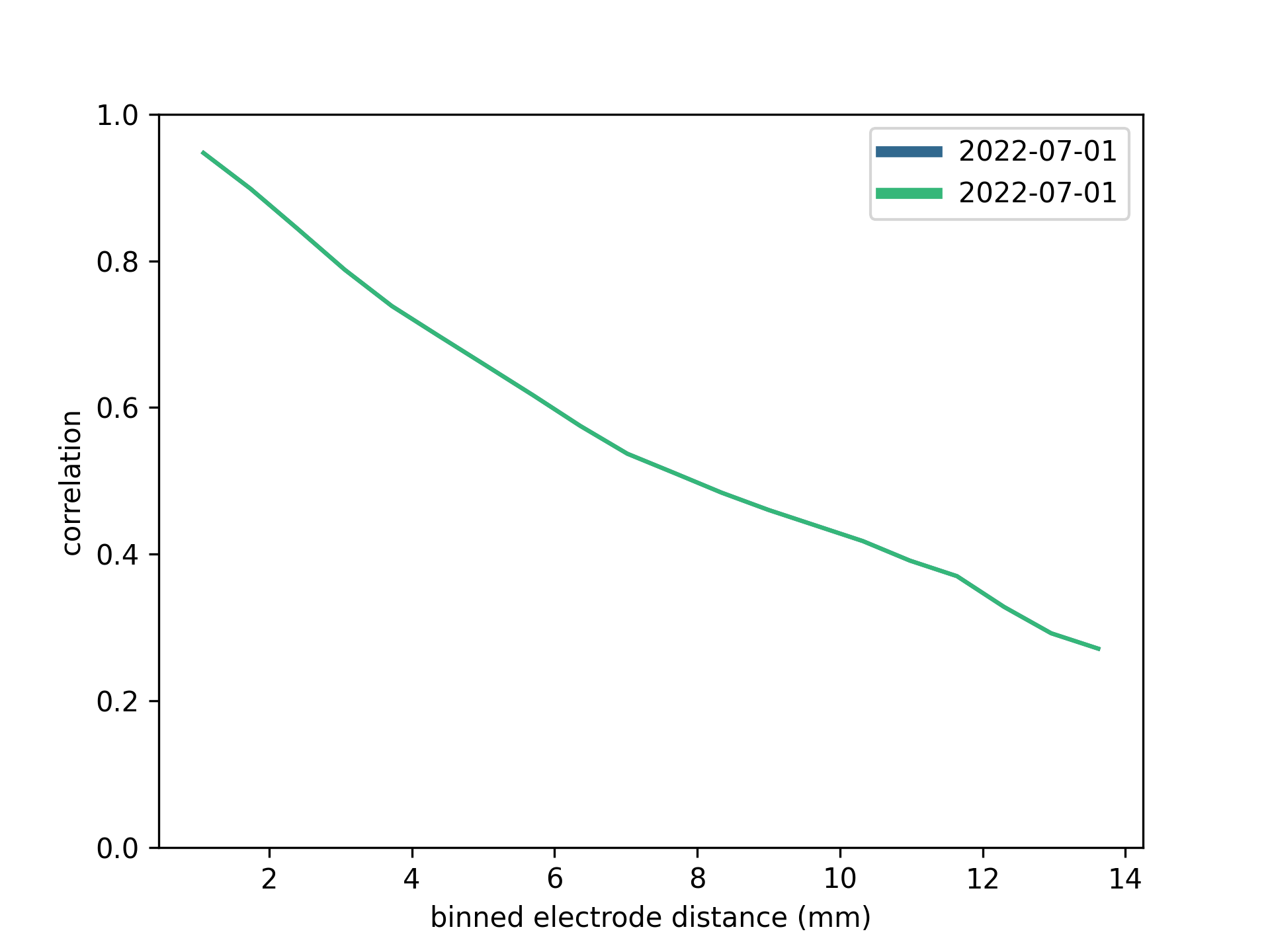
- aopy.visualization.base.plot_corr_over_elec_distance(elec_data, elec_pos, ax=None, **kwargs)[source]
Makes a plot of correlation vs electrode distance for the given data.
- Parameters:
elec_data (nt, nelec) – electrode data with nch corresponding to elec_pos
elec_pos (nelec, 2) – x, y position of each electrode
ax (pyplot.Axes, optional) – axis on which to plot
kwargs (dict, optional) – other arguments to supply to
aopy.analysis.calc_corr_over_elec_distance()
Example
Using the multichannel test data generator in utils, we get a phase-shifted sine wave in each channel. Assigning each channel i to an electrode with position (i, 0), the correlation across distances looks like this:
duration = 0.5
samplerate = 1000
n_channels = 30
frequency = 100
amplitude = 0.5
acq_data = aopy.utils.generate_multichannel_test_signal(duration, samplerate, n_channels, frequency, amplitude)
acq_ch = (np.arange(n_channels)+1).astype(int)
elec_pos = np.stack((range(n_channels), np.zeros((n_channels,))), axis=-1)

plt.figure()
plot_corr_over_elec_distance(acq_data, acq_ch, elec_pos)

- Updated:
2024-03-13 (LRS): Changed input from acq_data and acq_ch to elec_data. 2024-07-01 (LRS): Fixed default x-axis label units to mm.
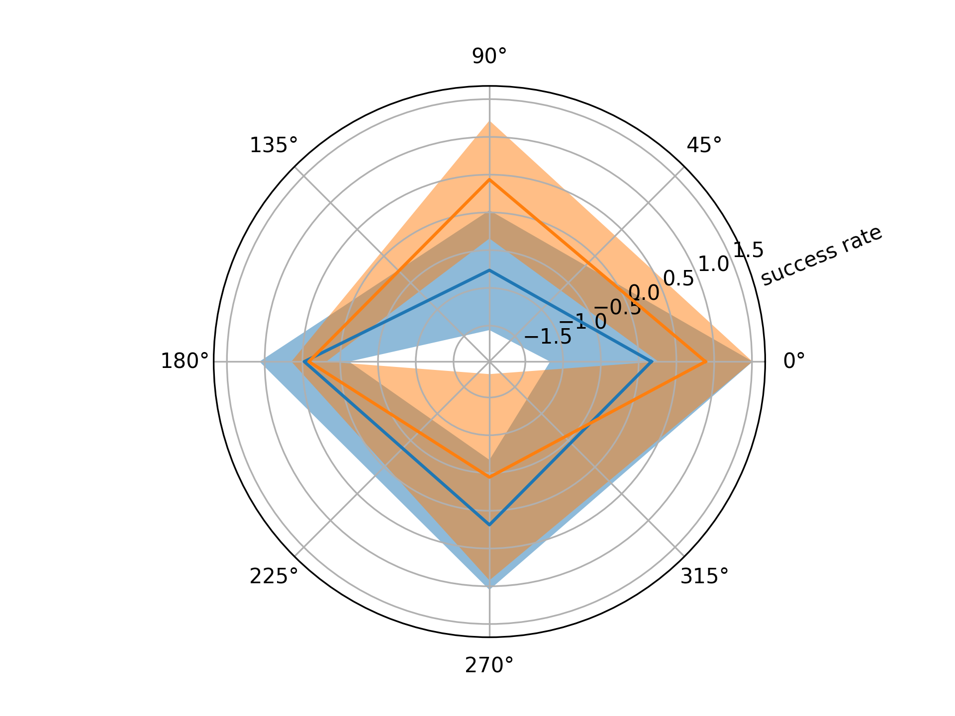
- aopy.visualization.base.plot_direction_tuning(per_direction_data, directions, show_var=True, wrap=True, ylabel='success rate', ax=None)[source]
Plot tuning curves for directional data. The mean across trials is plotted as a solid line and the variance as a shaded region around the mean. Works with both cartesian and polar axes.
- Parameters:
per_direction_data (ndir, nch, ntrial) – direction responses for each channel. If only one channel, can be (ndir, ntrial).
directions (ndir) – unique directions in radians
show_var (bool, optional) – if True, plots the standard deviation around the mean. Default True.
wrap (bool, optional) – if True, duplicates the first value to wrap the plot around a circle. Default True.
ylabel (str, optional) – label for the y-axis. Default “success rate”
ax (pyplot.Axes, optional) – axis to plot the tuning curves on. Can be cartesian or polar. Default the current axis.
Example
Polar plot of tuning curves for 4 targets
direction = [-np.pi, -np.pi/2, 0, np.pi/2]
data = np.random.normal(0, 1, (4, 2, 4))

plt.figure()
plot_direction_tuning(data, direction)
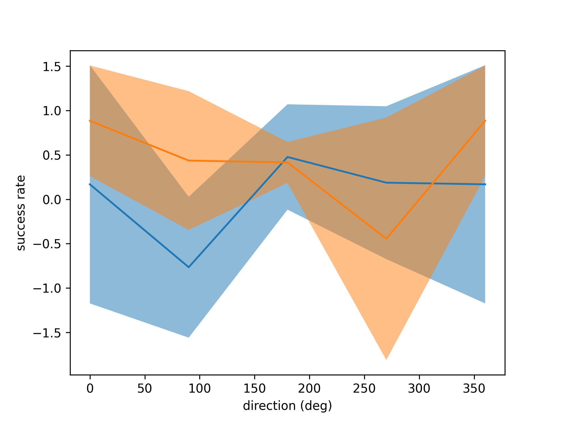
Again but with polar plot
fig = plt.figure()
ax = fig.add_subplot(projection='polar')

plot_direction_tuning(data, direction)
- aopy.visualization.base.plot_events_time(events, event_timestamps, labels, ax=None, colors=['tab:blue', 'tab:orange', 'tab:green'])[source]
This function plots multiple different events on the same plot. The first event (item in the list) will be displayed on the bottom of the plot.
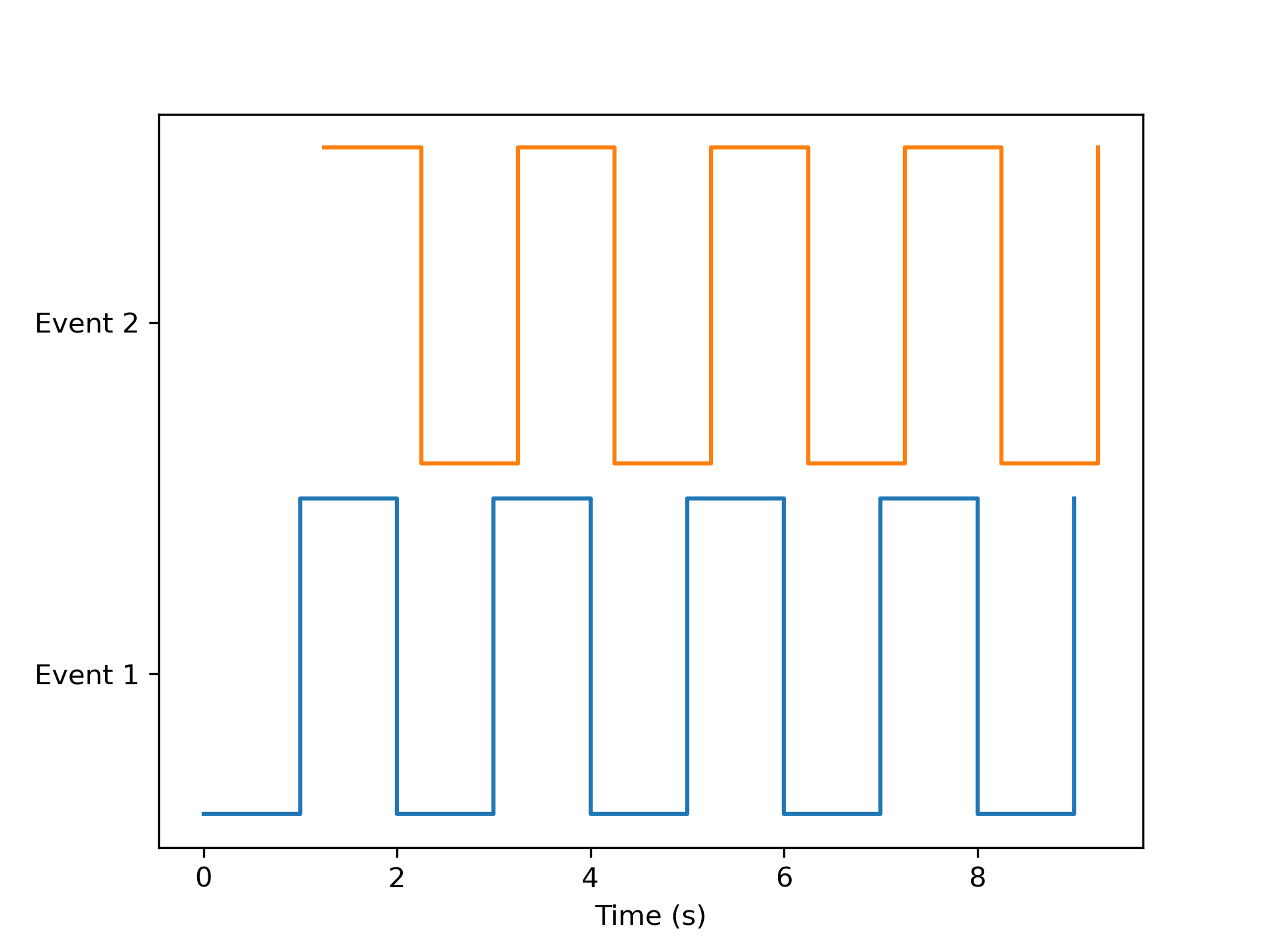
- Parameters:
events (list (nevents) of 1D arrays (ntime)) – List of Logical arrays that denote when an event(for example, a reward) occurred during an experimental session. Each item in the list corresponds to a different event to plot.
event_timestamps (list (nevents) of 1D arrays ntime) – List of 1D arrays of timestamps corresponding to the events list.
labels (list (nevents) of str) – Event names for each list item.
ax (axes handle) – Axes to plot
colors (list of str) – Color to use for each list item
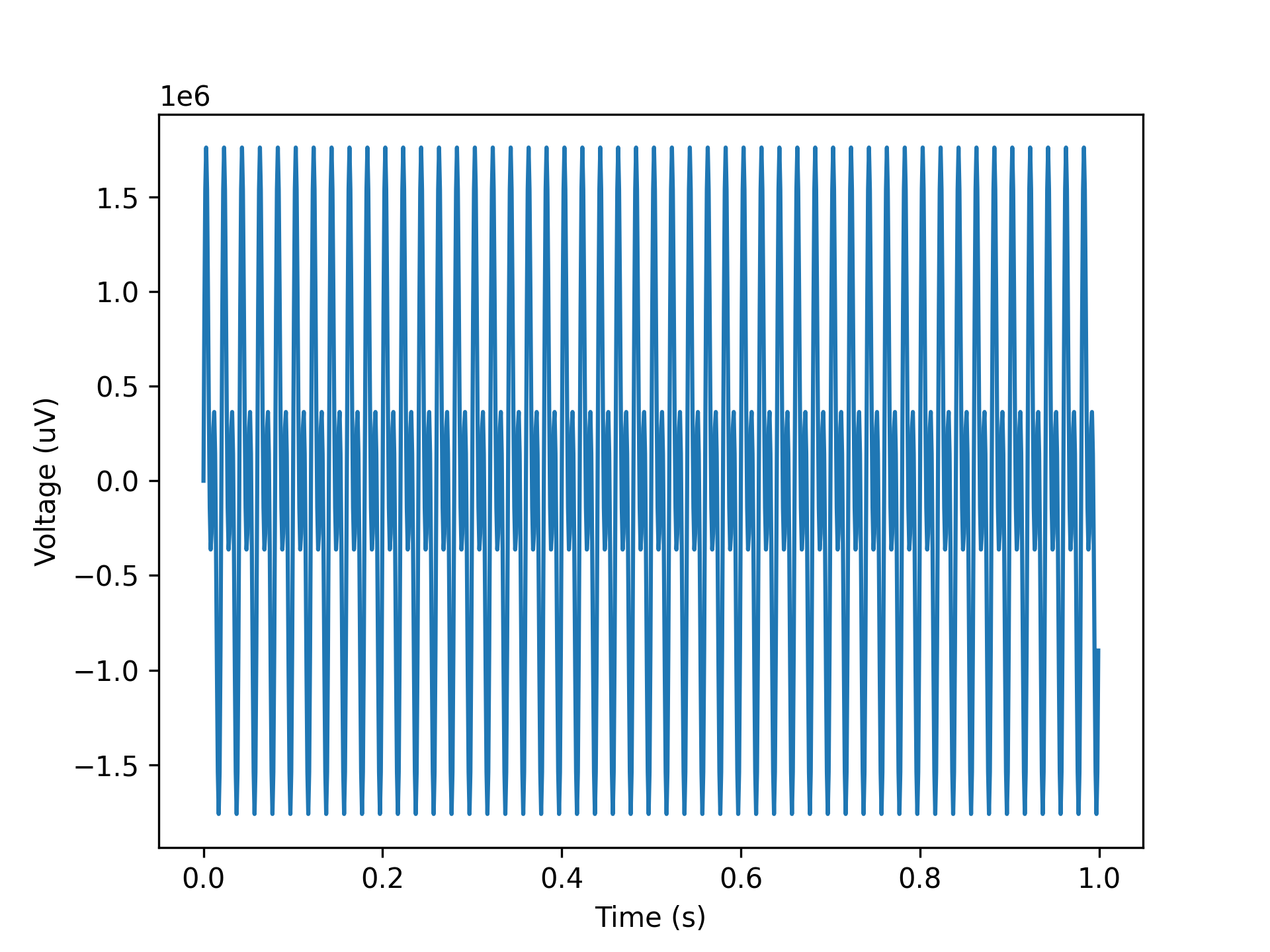
- aopy.visualization.base.plot_freq_domain_amplitude(data, samplerate, ax=None, rms=False)[source]
Plots a amplitude spectrum of each channel on the given axis. Just need to input time series data and this will calculate and plot the amplitude spectrum.
Example
Plot 50 and 100 Hz sine wave amplitude spectrum.
data = np.sin(np.pi*np.arange(1000)/10) + np.sin(2*np.pi*np.arange(1000)/10)
samplerate = 1000
plot_freq_domain_amplitude(data, samplerate) # Expect 100 and 50 Hz peaks at 1 V each
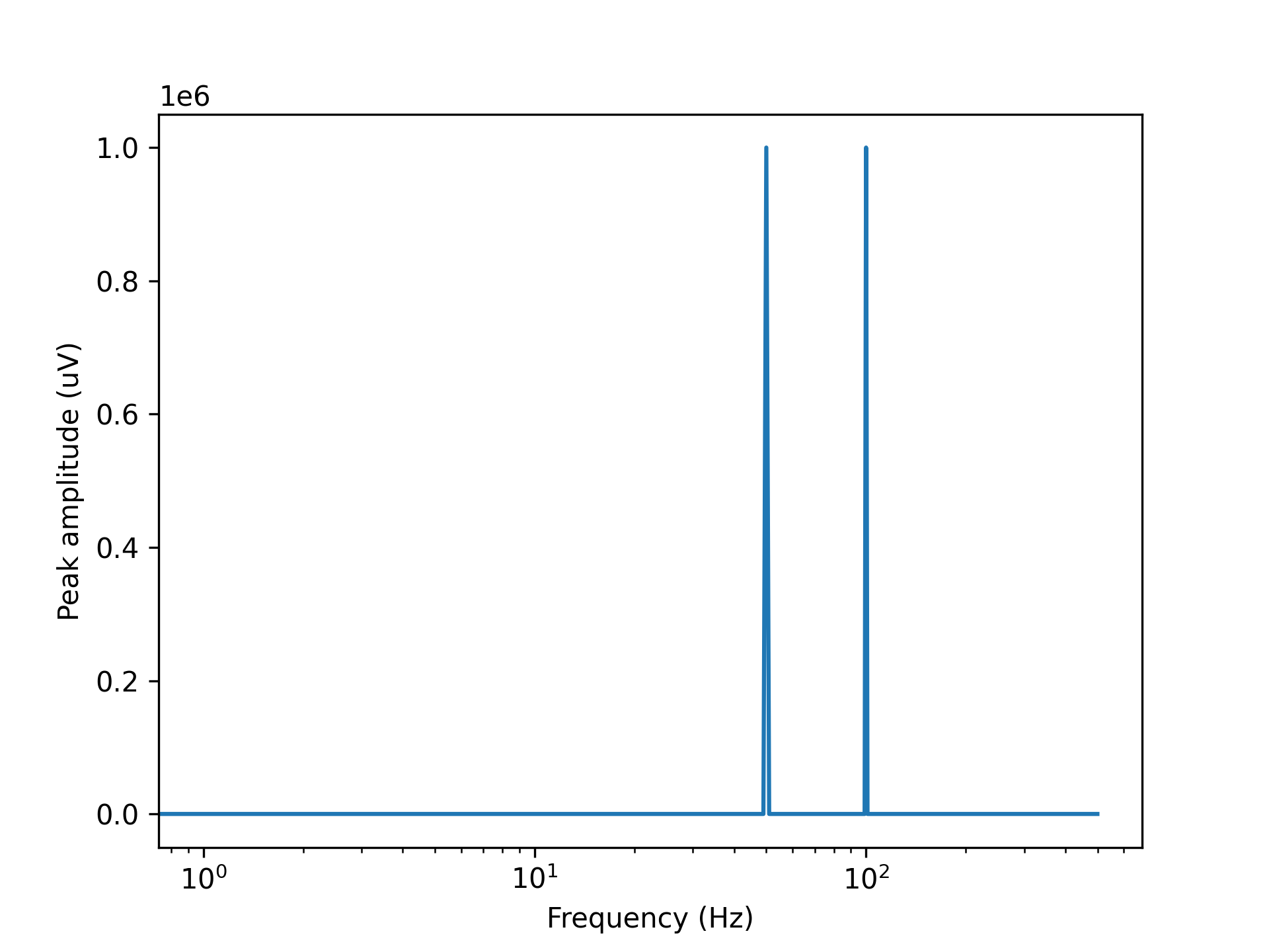
- Parameters:
data (nt, nch) – timeseries data in volts, can also be a single channel vector
samplerate (float) – sampling rate of the data
ax (pyplot axis, optional) – where to plot
rms (bool, optional) – compute root-mean square amplitude instead of peak amplitude
- aopy.visualization.base.plot_image_by_time(time, image_values, ylabel='trial', cmap='bwr', ax=None)[source]
Makes an nt x ntrial image colored by the timeseries values.
Example
time = np.array([-2, -1, 0, 1, 2, 3])
data = np.array([[0, 0, 1, 1, 0, 0],
                [0, 0, 0, 1, 1, 0]]).T
plot_image_by_time(time, data)
filename = 'image_by_time.png'
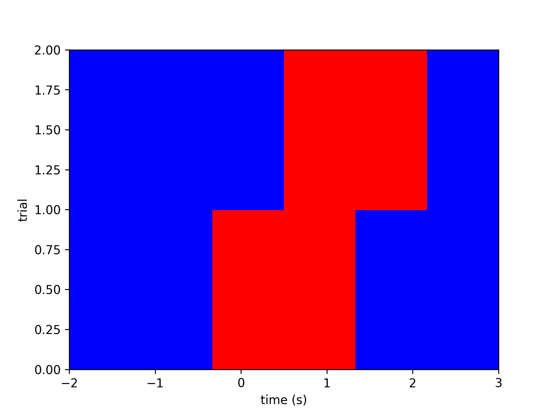
- Parameters:
time (nt) – time vector to plot along the x axis
image_values (nt, [nch or ntr]) – time-by-trial or time-by-channel data
ylabel (str, optional) – description of the second axis of image_values. Defaults to ‘trial’.
cmap (str, optional) – colormap with which to display the image. Defaults to ‘bwr’.
ax (pyplot.Axes, optional) – Axes object on which to plot. Defaults to None.
- Returns:
the image object returned by pyplot
- Return type:
pyplot.AxesImage
- aopy.visualization.base.plot_laser_sensor_alignment(sensor_volts, samplerate, stim_times, ax=None)[source]
Plot laser sensor data aligned to the stimulus times. Useful to debug laser timing issues to make sure the laser is actually on when you think it is.
- Parameters:
sensor_volts ((nstim,) float array) – laser sensor data
samplerate (float) – sampling rate of the sensor data
stim_times ((nstim,) array) – times at which the laser was turned on
ax (pyplot.Axes, optional) – axes on which to plot. Default current axis.
kwargs (dict, optional) – other keyword arguments to pass to pyplot
- Returns:
image object returned from pyplot.pcolormesh. Useful for adding colorbars, etc.
- Return type:
pyplot.Image
Examples

- aopy.visualization.base.plot_mean_fr_per_target_direction(means_d, neuron_id, ax, color, this_alpha, this_label)[source]
generate a plot of mean firing rate per target direction
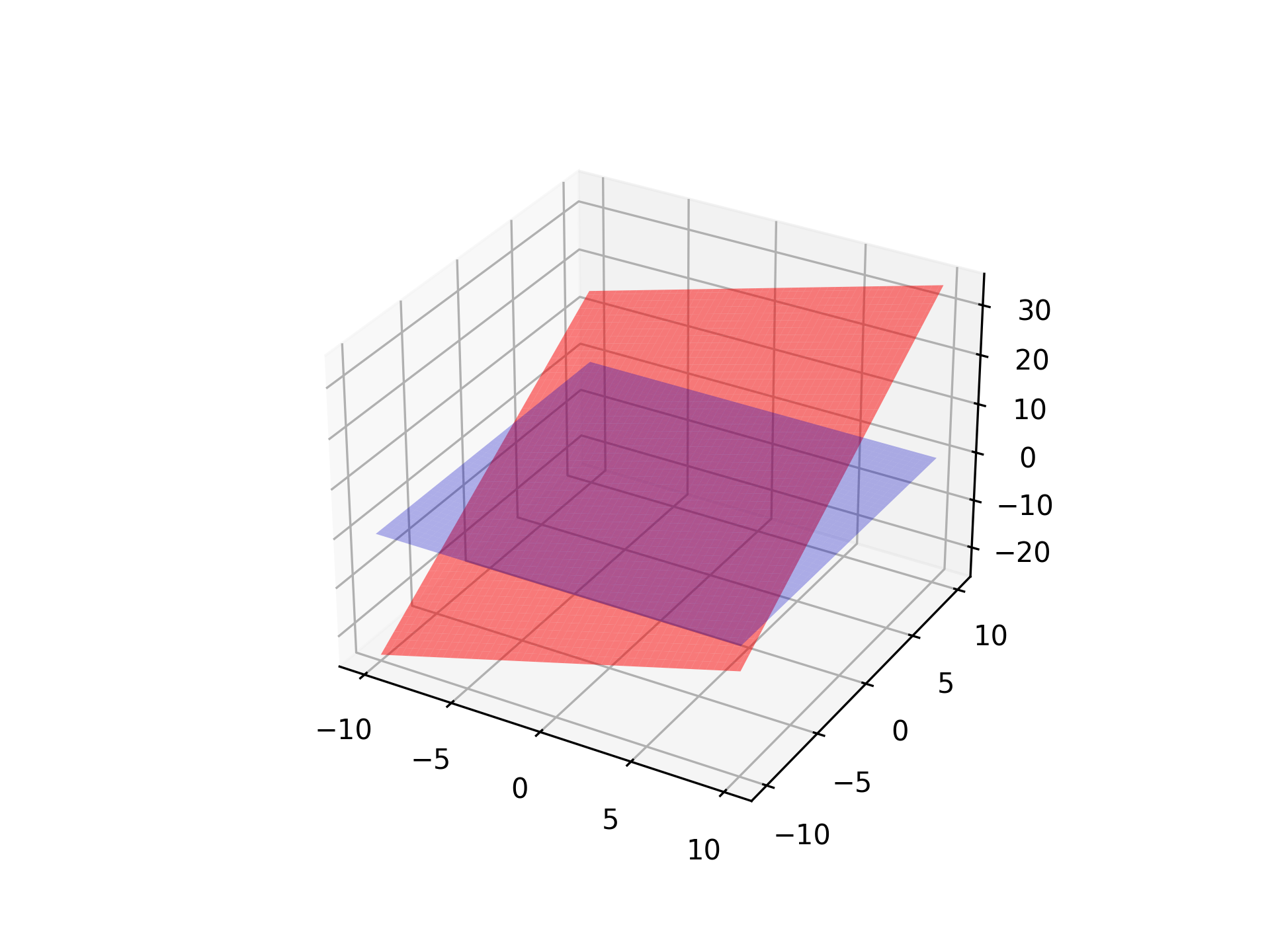
- aopy.visualization.base.plot_plane(plane, gain=1.0, color='grey', alpha=0.15, resolution=100, ax=None, **kwargs)[source]
Plots a 3D plane centered at the origin.
- Parameters:
plane (4-tuple or (3,3) or (4,4) matrix) – Specifies how the plane is transformed: - If shape (3,3) or (4,4): Treated as a transformation matrix for rotating the plane z=0. - If shape (4,): Treated as plane equation coefficients (A, B, C, D) for Ax + By + Cz + D = 0.
gain (float, optional) – Scaling factor for the plane’s size. Default is 1.0. Recommend using exp_gain from metadata.
color (str, optional) – Color of the plane. Default is ‘grey’.
alpha (float, optional) – Transparency of the plane, where 1 is opaque and 0 is fully transparent. Default is 0.15.
resolution (int, optional) – Number of subdivisions for the plane. Higher values increase smoothness. Default is 100.
ax (mpl_toolkits.mplot3d.Axes3D) – The Matplotlib 3D axis on which to plot the plane.
- Raises:
ValueError – If ‘plane’ does not have a valid shape (expected (3,3), (4,4), or (4,)).
Note
When ‘plane’ is a transformation matrix, only the upper-left (3,3) submatrix is used.
When ‘plane’ is a plane equation (A, B, C, D), the function solves for z using z = (-A * x - B * y - D) / C.
Examples
import matplotlib.pyplot as plt
from mpl_toolkits.mplot3d import Axes3D
import numpy as np

fig = plt.figure()
ax = fig.add_subplot(111, projection='3d')

# Example using a transformation matrix (identity)
plane = np.eye(3)
plot_plane(plane, gain=1.0, color='blue', alpha=0.3, ax=ax)

# Example using a plane equation Ax + By + Cz + D = 0
plane_eq = np.array([1, 2, -1, 5])  # x + 2y - z + 5 = 0
plot_plane(plane_eq, gain=1.0, color='red', alpha=0.5, ax=ax)

plt.show()
- aopy.visualization.base.plot_raster(data, cue_bin=None, ax=None)[source]
Create a raster plot for binary input data and show the relative timing of an event with a vertical red line

- Parameters:
data (ntime, ncolumns) – 2D array of data. Typically a time series of spiking events across channels or trials (not spike count- must contain only 0 or 1).
cue_bin (float) – time bin at which an event occurs. Leave as ‘None’ to only plot data. For example: Use this to indicate ‘Go Cue’ or ‘Leave center’ timing.
ax (plt.Axis) – axis to plot raster plot
- Returns:
raster plot plotted in appropriate axis
- Return type:
None
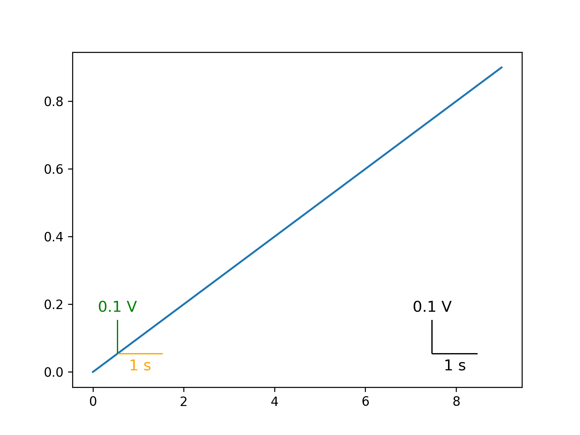
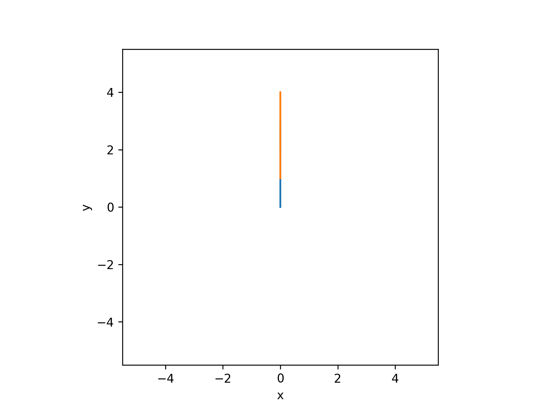
- aopy.visualization.base.plot_scalebar(ax, size, label, color='black', fontsize=12, vertical=False, bbox_to_anchor=[0.1, 0.1], **kwargs)[source]
Add a scalebar to a plot with the given size and label. The scalebar can be vertical or horizontal. The left edge (bottom edge if vertical) of the scalebar will be located at the given bbox_to_anchor position in Axis units (0 to 1).
- Parameters:
ax (pyplot.Axes) – axis to plot the scalebar on
size (float) – size of the scalebar in units of the plot
label (str) – label for the scalebar, e.g. ‘1 s’ or ‘10 um’
color (str) – color of the scalebar. Can be any input that pyplot interprets as a color.
fontsize (int) – size of the font for the label
vertical (bool) – If True, the scalebar will be vertical. Default is horizontal.
bbox_to_anchor (tuple) – (x, y) position of the scalebar in the plot in Axis units. Default is (0.1, 0.1).
**kwargs – additional keyword arguments to pass to AnchoredSizeBar
Examples
Adding a scalebar to a plot with a size of 10 and a label of ‘10 ms’.
plt.subplots()
plt.plot(np.arange(10), np.arange(10)/10)
aopy.visualization.plot_scalebar(plt.gca(), 1.5, '1 s', color='orange')
aopy.visualization.plot_scalebar(plt.gca(), 0.15, '0.1 V', vertical=True, color='green')
aopy.visualization.plot_xy_scalebar(plt.gca(), 1.5, '1 s', 0.15, '0.1 V', bbox_to_anchor=(0.8, 0.1))
filename = 'scalebar_example.png'
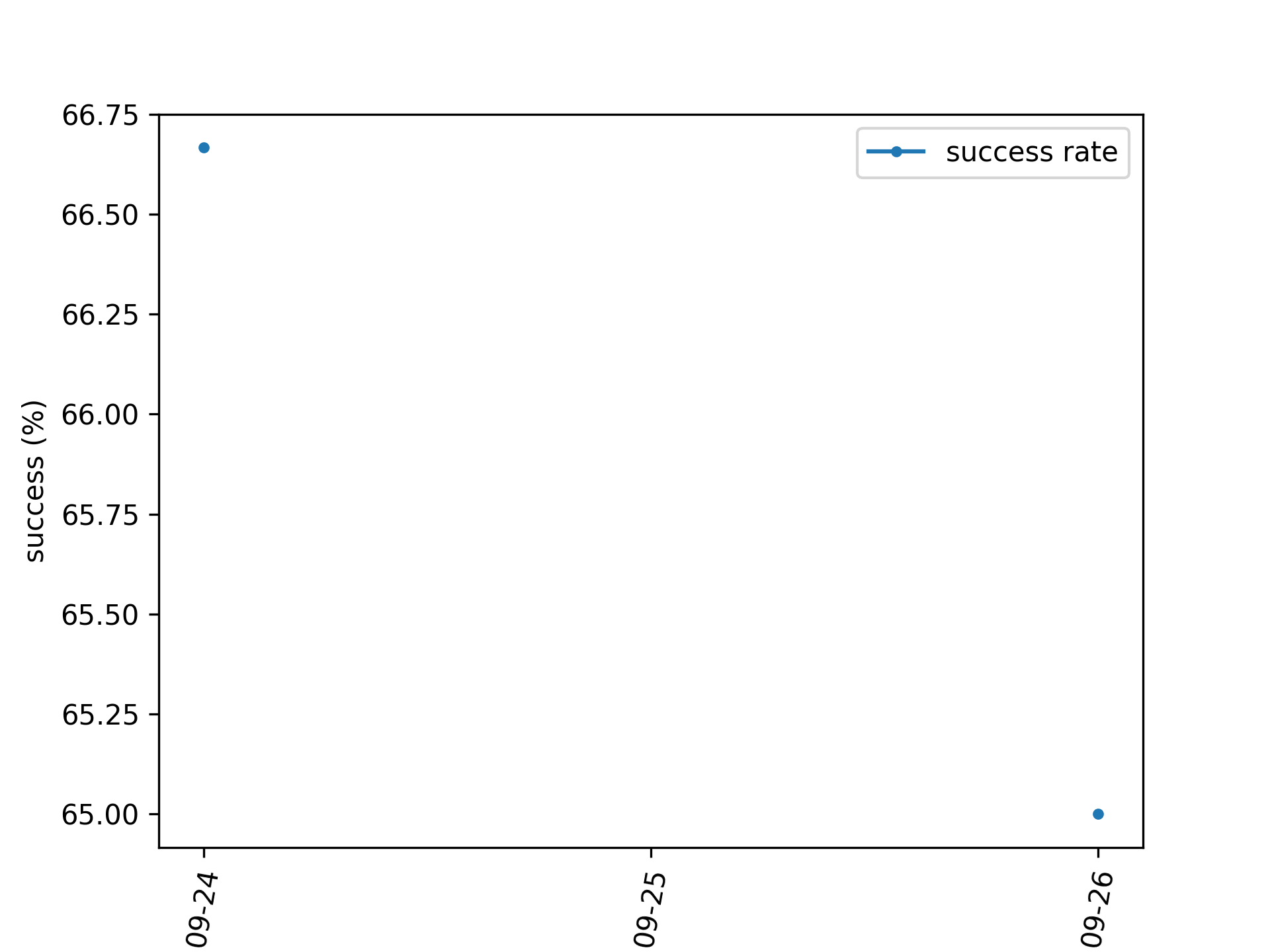
- aopy.visualization.base.plot_sessions_by_date(trials, dates, *columns, method='sum', labels=None, ax=None)[source]
Plot session data organized by date and aggregated such that if there are multiple rows on a given date they are combined into a single value using the given method. If the method is ‘mean’ then the values will be averaged for each day, for example for size of cursor. The average is weighted by the number of trials in that session. If the method is ‘sum’ then the values will be added together on each day, for example for number of trials.
Example
Plotting success rate averaged across days.
from datetime import date, timedelta
date = [date.today() - timedelta(days=1), date.today() - timedelta(days=1), date.today()]
success = [70, 65, 65]
trials = [10, 20, 10]

fig, ax = plt.subplots(1,1)
plot_sessions_by_date(trials, dates, success, method='mean', labels=['success rate'], ax=ax)
ax.set_ylabel('success (%)')
- Parameters:
trials (nsessions) –
dates (nsessions) –
*columns (nsessions) – dataframe columns or numpy arrays to plot
method (str, optional) – how to combine data within a single date. Can be ‘sum’ or ‘mean’.
labels (list, optional) – string label for each column to go into the legend
ax (pyplot.Axes, optional) – axis on which to plot
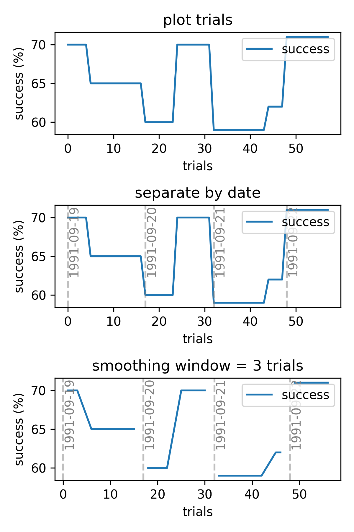
- aopy.visualization.base.plot_sessions_by_trial(trials, *columns, dates=None, smoothing_window=None, labels=None, ax=None, **kwargs)[source]
Plot session data by absolute number of trials completed. Optionally split up the sessions by date and apply smoothing to each day’s data.
Example
Plotting success rate over three sessions.
success = [70, 65, 60]
trials = [10, 20, 10]

fig, ax = plt.subplots(1,1)
plot_sessions_by_trial(trials, success, labels=['success rate'], ax=ax)
ax.set_ylabel('success (%)')
- Parameters:
trials (nsessions) – number of trials in each session
*columns (nsessions) – dataframe columns or numpy arrays to plot
dates (nsessions, optional) – dataframe columns or numpy arrays of the date of each session
smoothing_window (int, optional) – number of trials to smooth. Default no smoothing.
labels (list, optional) – string label for each column to go into the legend
ax (pyplot.Axes, optional) – axis on which to plot
- aopy.visualization.base.plot_spatial_drive_map(data, elec_data=False, drive_type='ECoG244', interp=True, grid_size=(16, 16), cmap='bwr', theta=0, ax=None, **kwargs)[source]
Plot a 2D spatial map of data from a spatial electrode array.
- Parameters:
data ((nch,) array) – values from the spatial drive to plot in 2D
elec_data (bool, optional) – if True, treat data as electrode data (i.e. nch == nelec), otherwise treat it as acquisition data (nch >= nelec). Defaults to False.
interp (bool, optional) – flag to include 2D interpolation of the result. Defaults to True.
drive_type (str, optional) – type of drive. See
load_chmap()for options. Defaults to ‘ECoG244’.interp – flag to include 2D interpolation of the result. See
calc_data_map()for options. Defaults to True.grid_size ((2,) tuple, optional) – size of the grid to interpolate to. Defaults to (16,16).
cmap (str, optional) – matplotlib colormap to use in image. Defaults to ‘bwr’.
theta (float) – rotation (in degrees) to apply to positions. rotations are applied clockwise, e.g., theta = 90 rotates the map clockwise by 90 degrees, -90 rotates the map anti-clockwise by 90 degrees. Default 0.
ax (pyplot.Axes, optional) – axis on which to plot. Defaults to None.
kwargs (dict) – dictionary of additional keyword argument pairs to send to calc_data_map and plot_spatial_map.
- Returns:
image returned by pyplot.imshow. Use to add colorbar, etc.
- Return type:
pyplot.Image
Updated in v0.9.1 - removed bad_elec argument, added elec_data argument
- aopy.visualization.base.plot_spatial_drive_maps(maps, nrows_ncols, axsize, clim=None, theta=0, axes_pad=0.05, label_mode='1', cbar_mode=None, **kwargs)[source]
Plot multiple spatial maps on the same figure. Uses mpl_toolkits.axes_grid1.ImageGrid to create a grid of axes.
- Parameters:
maps (list) – list of (nch,) list of values recorded from a spatial drive (e.g. electrode array) to plot
nrows_ncols ((2,) tuple) – number of rows and columns of subplots
axsize ((2,) tuple) – (width, height) size of each subplot in inches
clim ((2,) tuple, optional) – (min, max) to set the color axis limits. Default None, show the whole range, each image will be scaled independently.
theta (float or list of, optional) – rotation (in degrees) to apply to positions. rotations are applied clockwise, e.g., theta = 90 rotates the map clockwise by 90 degrees, -90 rotates the map anti-clockwise by 90 degrees. Default 0. If a list is given, it must be the same length as maps and each map will be rotated by the corresponding theta value.
axes_pad (float, optional) – padding between axes. Default 0.1
label_mode (str, optional) – label mode for ImageGrid {“L”, “1”, “all”, None}. Default None.
cbar_mode (str, optional) – colorbar mode for ImageGrid {“each”, “single”, None}. Default None.
**kwargs – additional keyword arguments to pass to
plot_spatial_drive_map()
- Returns:
- tuple containing:
fig (pyplot.Figure): the created figure
axes (np.ndarray): the created axes returned by ImageGrid
ims (list): list of image handles
cbars (list): list of colorbar handles
- Return type:
tuple
Examples
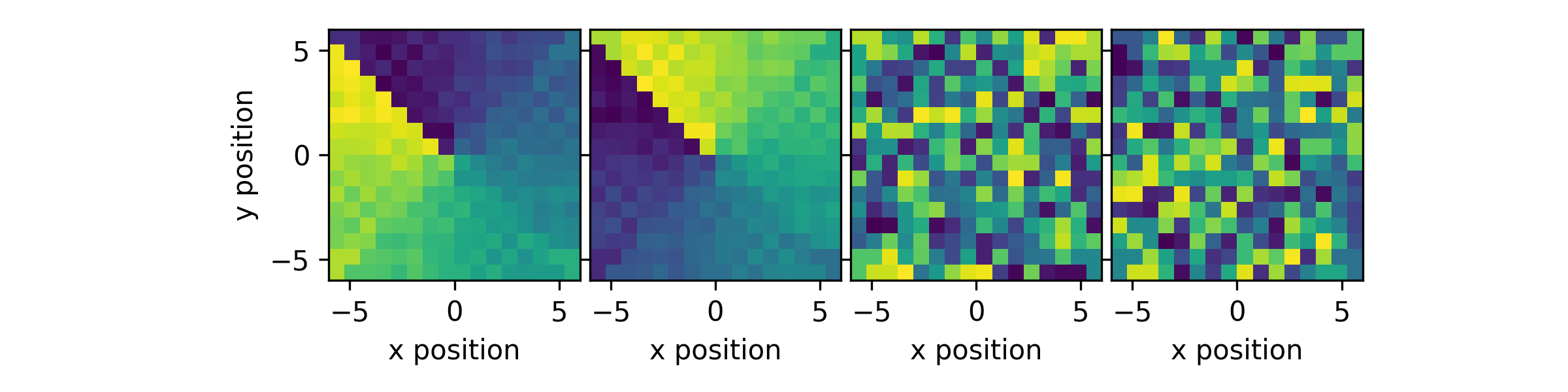
Create some test maps (ECoG244, ECoG244 flipped, random, random flipped) and plot them in different configurations. First, plot them in a 1x4 grid with a single colorbar.
im1 = np.arange(256).astype(float)
im2 = np.flip(im1)
im3 = im1.copy()
np.random.shuffle(im3)
im4 = np.flip(im3)
maps = [im1, im2, im3, im4]
plot_spatial_drive_maps(maps, (1,4), (2,2), cmap='viridis', clim=(0,255), label_mode="L")
plt.tight_layout()
Now plot them in a 2x2 grid with a single colorbar.
plot_spatial_drive_maps(maps, (2,2), (2,2), cmap='viridis', clim=(0,255), cbar_mode='single')
plt.tight_layout()
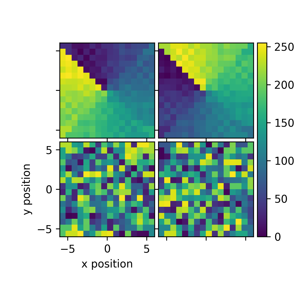
Last plot them in a 2x2 grid with a colorbar for each map. We need to change the horizontal spacing to make the colorbars fit. We can also make adjustmests after plotting using the returned axes.
fig, axes, ims, cbars = plot_spatial_drive_maps(maps, (2,2), (2,2), cmap='viridis', clim=(0,255), label_mode=None, cbar_mode='each', axes_pad=(0.4,0.05))
axes[0].set_clim(127,255)
plt.tight_layout()
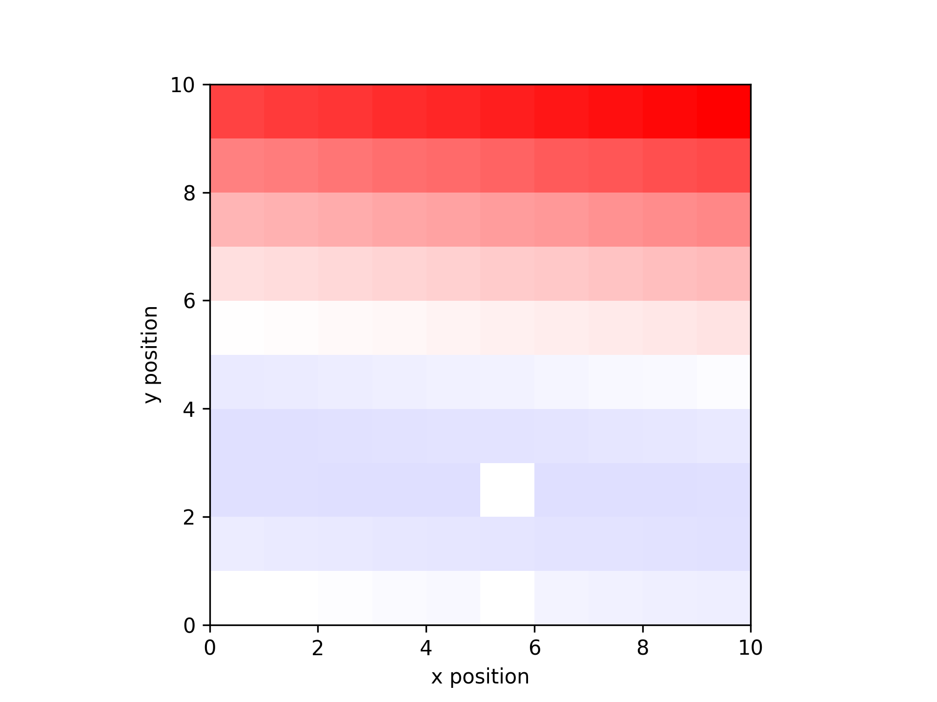
- aopy.visualization.base.plot_spatial_map(data_map, x, y, alpha_map=None, ax=None, cmap='bwr', nan_color='black', clim=None)[source]
Wrapper around plt.imshow for spatial data
- Parameters:
data_map ((2,n) array) – map of x,y data
x (list) – list of x positions
y (list) – list of y positions
alpha_map ((2,n) array) – map of alpha values (optional, default alpha=1 everywhere). If the alpha values are outside of the range (0,1) they will be scaled automatically.
ax (int, optional) – axis on which to plot, default gca
cmap (str, optional) – matplotlib colormap to use in image. default ‘bwr’
nan_color (str, optional) – color to plot nan values, or None to leave them invisible. default ‘black’
clim ((2,) tuple) – (min, max) to set the c axis limits. default None, show the whole range
- Returns:
image object which you can use to add colorbar, etc.
- Return type:
mappable
Examples
Make a plot of a 10 x 10 grid of increasing values with some missing data.
data = np.linspace(-1, 1, 100)
x_pos, y_pos = np.meshgrid(np.arange(0.5,10.5),np.arange(0.5, 10.5))
missing = [0, 5, 25]
data_missing = np.delete(data, missing)
x_missing = np.reshape(np.delete(x_pos, missing),-1)
y_missing = np.reshape(np.delete(y_pos, missing),-1)

data_map = get_data_map(data_missing, x_missing, y_missing)
plot_spatial_map(data_map, x_missing, y_missing)
Make the same image but include a transparency layer
data = np.linspace(-1, 1, 100)
x_pos, y_pos = np.meshgrid(np.arange(0.5,10.5),np.arange(0.5, 10.5))
missing = [0, 5, 25]
data_missing = np.delete(data, missing)
x_missing = np.reshape(np.delete(x_pos, missing),-1)
y_missing = np.reshape(np.delete(y_pos, missing),-1)
data_map = get_data_map(data_missing, x_missing, y_missing)
plot_spatial_map(data_map, x_missing, y_missing, alpha_map=data_map)
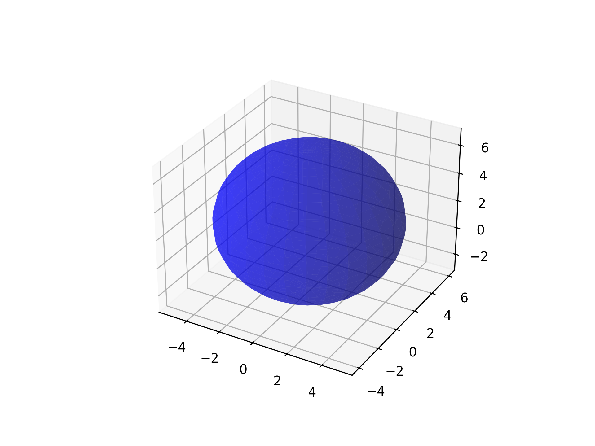
- aopy.visualization.base.plot_sphere(location, color='gray', radius=4, resolution=20, alpha=1, bounds=None, ax=None, **kwargs)[source]
Plots a 3D sphere on a specified 3D Matplotlib axis. If no axis is specified, opens a new figure with a single 3D axis.
- Parameters:
location (tuple or list) – Coordinates of the sphere’s center, specified as (x, y, z).
color (str, optional) – Color of the sphere. Default is ‘gray’.
radius (float, optional) – Radius of the sphere. Default is 4.
resolution (int, optional) – Number of subdivisions for the sphere’s surface. Higher values result in a smoother appearance but may reduce performance. Default is 20.
alpha (float, optional) – Transparency of the sphere, where 1 is opaque and 0 is fully transparent. Default is 1.
bounds (tuple, optional) – 6-element tuple describing (-x, x, -y, y, -z, z) cursor bounds.
ax (mpl_toolkits.mplot3d.Axes3D, optional) – The Matplotlib 3D axis on which to plot the sphere.
Examples
To plot a semi-transparent blue sphere with a radius of 1 at the origin:
import matplotlib.pyplot as plt
from mpl_toolkits.mplot3d import Axes3D

fig = plt.figure()
ax = fig.add_subplot(111, projection='3d')
plot_sphere(location=(0, 1, 2), color='blue', radius=5, resolution=30, alpha=0.5, ax=ax)
- aopy.visualization.base.plot_targets(target_positions, target_radius, bounds=None, alpha=0.5, origin=(0, 0, 0), ax=None, unique_only=True)[source]
Add targets to an axis. If any targets are at the origin, they will appear in a different color (magenta). Works for 2D and 3D axes
Example
Plot four peripheral and one central target.
target_position = np.array([
    [0, 0, 0],
    [1, 1, 0],
    [-1, 1, 0],
    [1, -1, 0],
    [-1, -1, 0]
])
target_radius = 0.1
plot_targets(target_position, target_radius, (-2, 2, -2, 2))
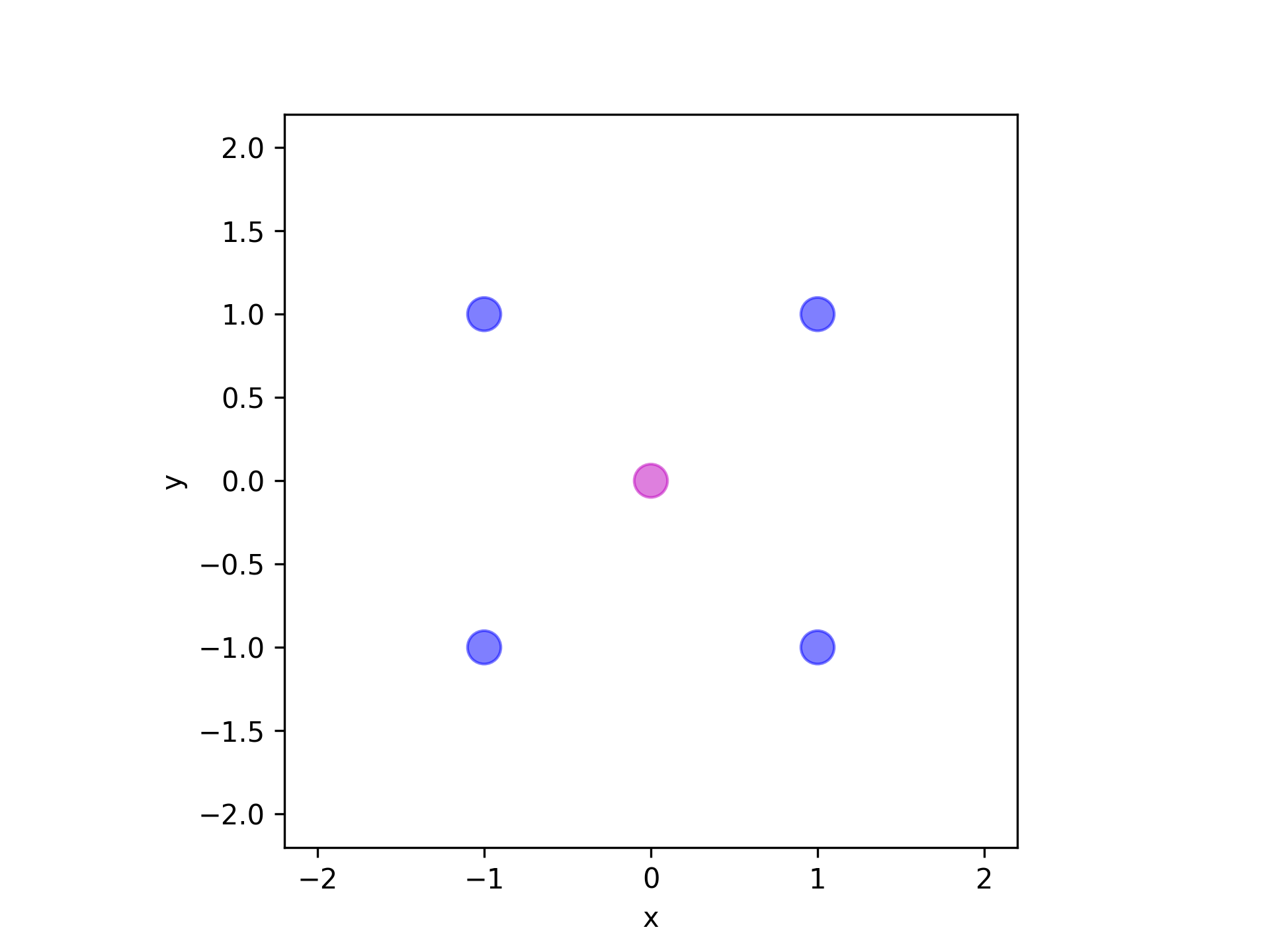
- Parameters:
target_positions (ntarg, 3) – array of target (x, y, z) locations
target_radius (float) – radius of each target
bounds (tuple, optional) – 6-element tuple describing (-x, x, -y, y, -z, z) cursor bounds
origin (tuple, optional) – (x, y, z) position of the origin
ax (plt.Axis, optional) – axis to plot the targets on
unique_only (bool, optional) – If True, function will only plot targets with unique positions (default: True)
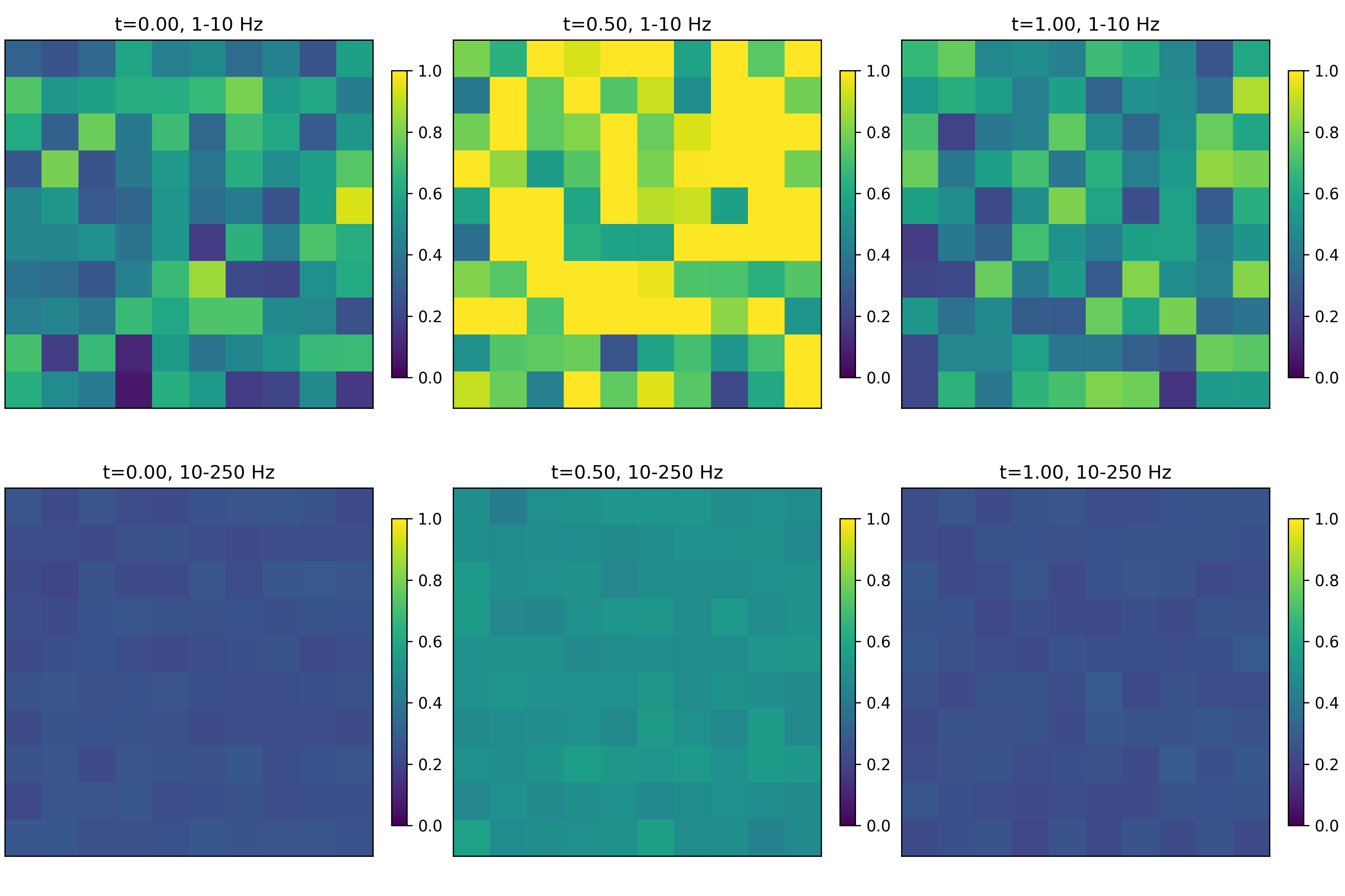
- aopy.visualization.base.plot_tf_map_grid(freqs, time, tf_data, bands, elec_pos, clim=None, interp_grid=None, cmap='viridis', grid_size=(4, 4), colorbar=True, **kwargs)[source]
Plot a grid of different frequency bands and time points for a given time-frequency map across spatial locations.
- Parameters:
freqs (nfreq,) – frequency values
time (nt,) – time values
tf_data (nfreq, nt, nch) – time-frequency data across spatial channels
bands (list) – list of tuples of frequency bands to plot
elec_pos (nch, 2) – x, y position of each electrode
clim (tuple, optional) – color limits for the plot, e.g. (0,1) for tfcoh maps. Default None
interp_grid (tuple, optional) – (x, y) grid to interpolate the data onto. Default None
cmap (str, optional) – colormap to use for plotting. Default ‘viridis’
grid_size (tuple, optional) – (width, height) in inches of each subplot grid. Default (4,4)
kwargs (dict, optional) – other keyword arguments to pass to calc_data_map
- Returns:
axes objects for each subplot in the grid
- Return type:
list of pyplot.Axes
Examples
Random power across space with increased power at time 1 and decreased power in high frequencies.
nfreq = 100
nt = 3
nch = 100
freqs = np.linspace(1,250,nfreq)
time = np.linspace(0, 1, nt)
tf_data = np.random.rand(nfreq,nt,nch)
tf_data[:,1,:] *= 2 # increase power at time 1
tf_data[freqs > 10, :, :] *= 0.5 # decrease power in high frequencies
bands = [(1, 10), (10, 250)]
x, y = np.meshgrid(np.arange(10), np.arange(10))
elec_pos = np.zeros((100,2))
elec_pos[:,0] = x.reshape(-1)
elec_pos[:,1] = y.reshape(-1)
plot_tf_map_grid(freqs, time, tf_data, bands, elec_pos, clim=(0,1), interp_grid=None,
            cmap='viridis')
- aopy.visualization.base.plot_tfr(values, times, freqs, cmap='plasma', logscale=False, ax=None, **kwargs)[source]
Plot a time-frequency representation of a signal.
- Parameters:
values ((nt, nfreq) array) –
times ((nt,) array) –
freqs ((nfreq,) array) –
cmap (str, optional) – colormap to use for plotting
logscale (bool, optional) – apply a log scale to the color axis. Default False.
ax (pyplot.Axes, optional) – axes on which to plot. Default current axis.
kwargs (dict, optional) – other keyword arguments to pass to pyplot
- Returns:
image object returned from pyplot.pcolormesh. Useful for adding colorbars, etc.
- Return type:
pyplot.Image
Examples
fig, ax = plt.subplots(3,1,figsize=(4,6))

samplerate = 1000
data_200_hz = aopy.utils.generate_multichannel_test_signal(2, samplerate, 8, 200, 2)
nt = data_200_hz.shape[0]
data_200_hz[:int(nt/3),:] /= 3
data_200_hz[int(2*nt/3):,:] *= 2

data_50_hz = aopy.utils.generate_multichannel_test_signal(2, samplerate, 8, 50, 2)
data_50_hz[:int(nt/2),:] /= 2

data = data_50_hz + data_200_hz
print(data.shape)
aopy.visualization.plot_timeseries(data, samplerate, ax=ax[0])
aopy.visualization.plot_freq_domain_amplitude(data, samplerate, ax=ax[1])

freqs = np.linspace(1,250,100)
coef = aopy.analysis.calc_cwt_tfr(data, freqs, samplerate, fb=10, f0_norm=1, verbose=True)
t = np.arange(nt)/samplerate

print(data.shape)
print(coef.shape)
print(t.shape)
print(freqs.shape)
pcm = aopy.visualization.plot_tfr(abs(coef[:,:,0]), t, freqs, 'plasma', ax=ax[2])

fig.colorbar(pcm, label='Power', orientation = 'horizontal', ax=ax[2])
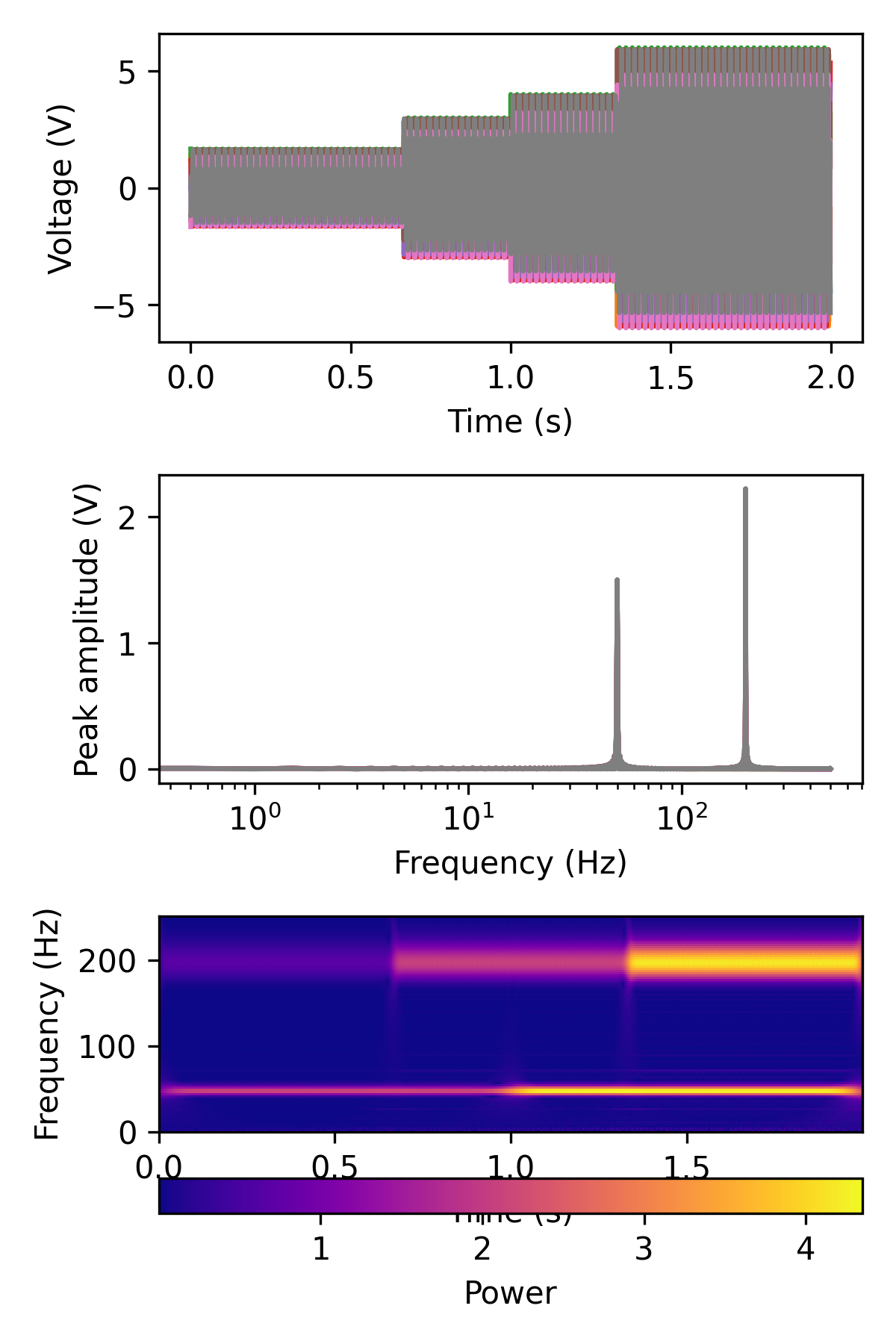
See also
calc_cwt_tfr()
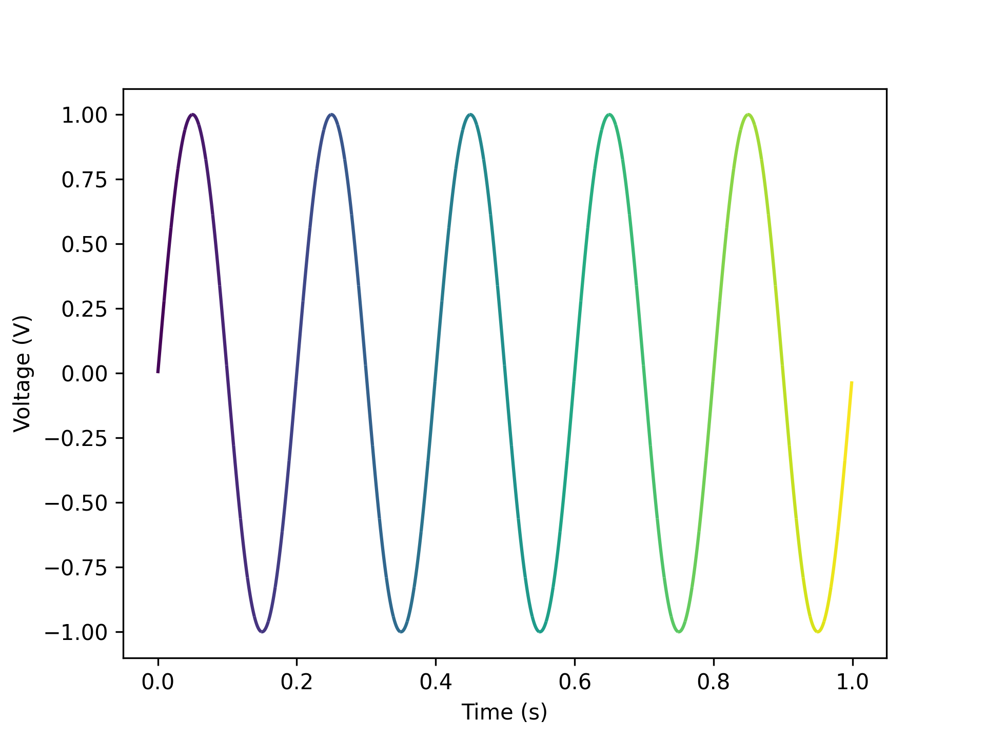
- aopy.visualization.base.plot_timeseries(data, samplerate, t0=0.0, ax=None, **kwargs)[source]
Plots data along time on the given axis. Default units are seconds and volts.
Example
Plot 50 and 100 Hz sine wave.
data = np.reshape(np.sin(np.pi*np.arange(1000)/10) + np.sin(2*np.pi*np.arange(1000)/10), (1000))
samplerate = 1000
plot_timeseries(data, samplerate)
- Parameters:
data (nt, nch) – timeseries data in volts, can also be a single channel vector
samplerate (float) – sampling rate of the data
t0 (float, optional) – time (in seconds) of the first sample. Default 0.
ax (pyplot axis, optional) – where to plot
kwargs (dict, optional) – optional keyword arguments to pass to plt.plot
- aopy.visualization.base.plot_trajectories(trajectories, bounds=None, ax=None, **kwargs)[source]
Draws the given trajectories, one at a time in different colors. Works for 2D and 3D axes. If 2D axes are given with 3D data, dimensions of interest are inferred from zero-columns if present. Plotting 3D data with no zero-columns on a 2D axis will show the data in the xy-plane (first two dimensions).
Example
Two random trajectories.
trajectories =[
    np.array([
        [0, 0, 0],
        [1, 1, 0],
        [2, 2, 0],
        [3, 3, 0],
        [4, 2, 0]
    ]),
    np.array([
        [-1, 1, 0],
        [-2, 2, 0],
        [-3, 3, 0],
        [-3, 4, 0]
    ])
]
bounds = (-5., 5., -5., 5., 0., 0.)
plot_trajectories(trajectories, bounds)

- ::
- trajectories =[
- np.array([
[0, 0, 0], [1, 0, 1], [2, 0, 2], [3, 0, 3], [4, 0, 2]
]), np.array([
[-1, 0, 1], [-2, 0, 2], [-3, 0, 3], [-3, 0, 4]
])
] bounds = (-5., 5., -5., 5., 0., 0.) plot_trajectories(trajectories, bounds)

- ::
- trajectories =[
- np.array([
[0, 0, 0], [0, 1, 0], [0, 2, 0], [0, 3, 0], [0, 2, 0]
]), np.array([
[0, 1, 0], [0, 2, 0], [0, 3, 0], [0, 4, 0]
])
] bounds = (-5., 5., -5., 5., 0., 0.) plot_trajectories(trajectories, bounds)
- Parameters:
trajectories (list) – list of (n, 2) or (n, 3) trajectories where n can vary across each trajectory
bounds (tuple, optional) – 6-element tuple describing (-x, x, -y, y, -z, z) cursor bounds
ax (plt.Axis, optional) – axis to plot the targets on
kwargs (dict) – keyword arguments to pass to the plt.plot function
- aopy.visualization.base.plot_tuning_curves(fit_params, mean_fr, targets, n_subplot_cols=5, ax=None)[source]
This function plots the tuning curves output from analysis.run_tuningcurve_fit overlaying the actual firing rate data. The dashed line is the model fit and the solid line is the actual data.
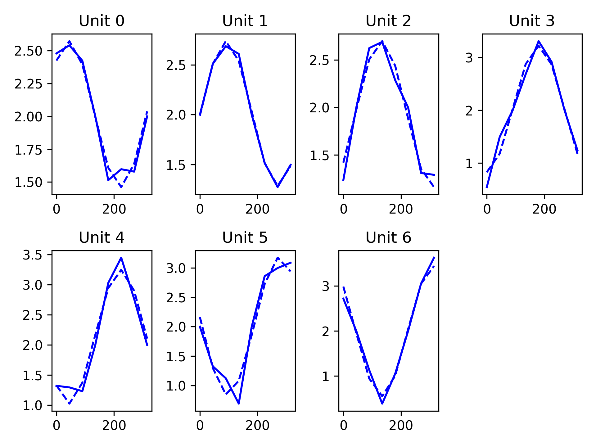
- Parameters:
fit_params (nunits, 3) – Model fit coefficients. Output from analysis.run_tuningcurve_fit or analysis.curve_fitting_func
mean_fr (nunits, ntargets) – The average firing rate for each unit for each target.
target_theta (ntargets) – Orientation of each target in a center out task [degrees]. Corresponds to order of targets in ‘mean_fr’
n_subplot_cols (int) – Number of columns to plot in subplot. This function will automatically calculate the number of rows. Defaults to 5
ax (axes handle) – Axes to plot
- aopy.visualization.base.plot_waveforms(waveforms, samplerate, plot_mean=True, ax=None)[source]
This function plots the input waveforms on the same figure and can overlay the mean if requested
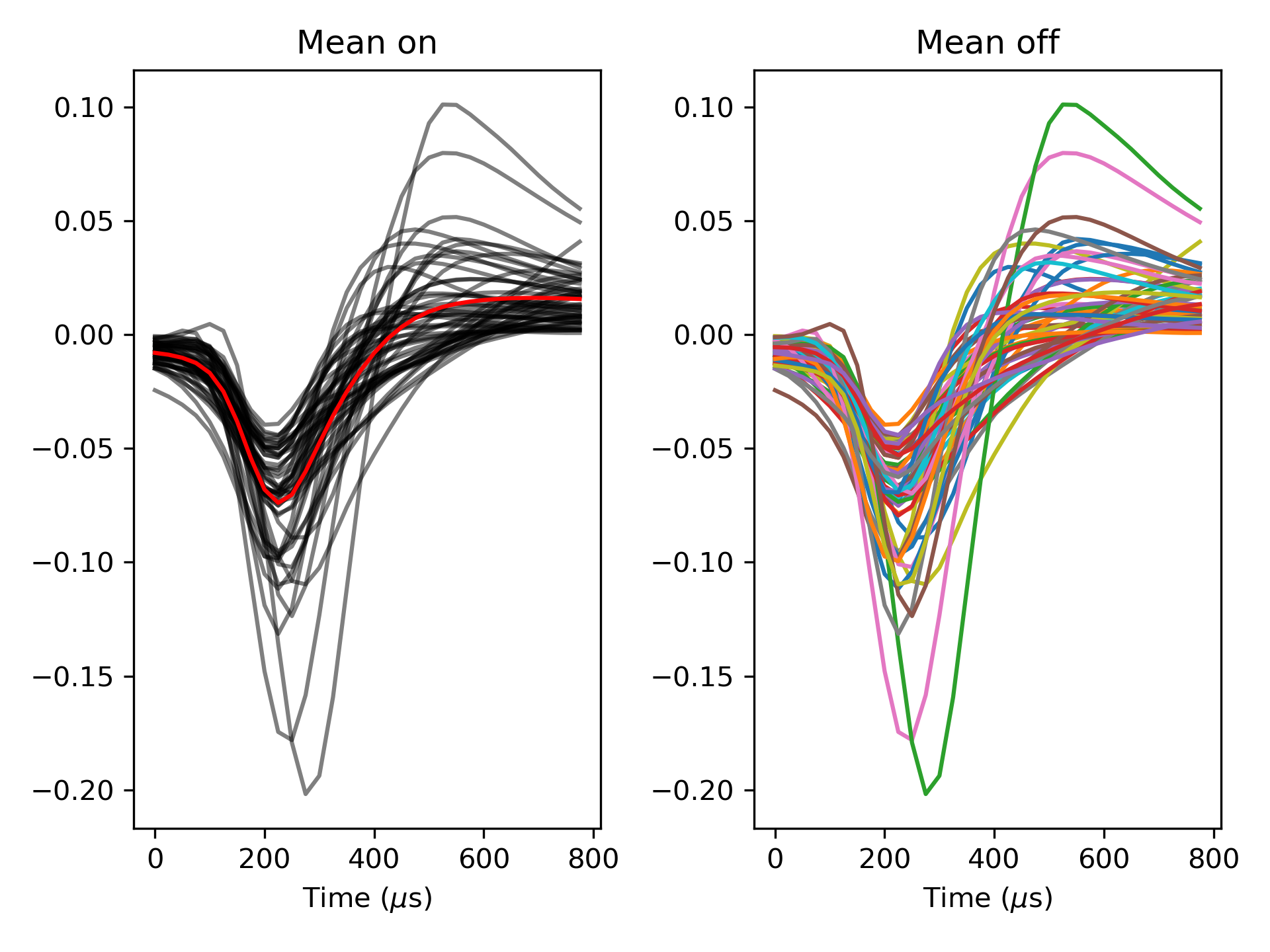
- Parameters:
waveforms (nt, nwfs) – Array of waveforms to plot
samplerate (float) – Sampling rate of waveforms to calculate time axis. [Hz]
plot_mean (bool) – Indicate if the mean waveform should be plotted. Defaults to plot mean.
ax (axes handle) – Axes to plot
- aopy.visualization.base.plot_xy_scalebar(ax, xsize, xlabel, ysize, ylabel, color='black', fontsize=12, bbox_to_anchor=[0.1, 0.1], **kwargs)[source]
Shortcut to add two scalebars to a plot with the given x and y sizes and labels.
- Parameters:
ax (pyplot.Axes) – axis to plot the scalebar on
xsize (float) – size of the x scalebar
xlabel (str) – label for the x scalebar
ysize (float) – size of the y scalebar
ylabel (str) – label for the y scalebar
color (str) – color of the scalebar. Can be any input that pyplot interprets as a color.
fontsize (int) – size of the font for the label
bbox_to_anchor (tuple) – (x, y) position of the scalebar in the plot in Axis units. Default is (0.1, 0.1).
**kwargs – additional keyword arguments to pass to AnchoredSizeBar
See also
plot_scalebar()
- aopy.visualization.base.profile_data_channels(data, samplerate, figuredir, **kwargs)[source]
Runs plot_channel_summary and combine_channel_figures on all channels in a data array
- Parameters:
data (nt, nch) – numpy array of neural data
samplerate (int) – sampling rate of data
figuredir (str) – string indicating file path to desired save directory
kwargs (**dict) – keyword arguments to pass to plot_channel_summary()
- aopy.visualization.base.reset_plot_color(ax)[source]
Utility to reset the color cycle on a given axis to the default.
- Parameters:
ax (pyplot.Axes) – specify which axis to reset the color
Examples
Using reset_plot_color to reset the color cycle between calls to plt.plot().
plt.subplots()
plt.plot(np.arange(10), np.ones(10))
aopy.visualization.reset_plot_color(plt.gca())
plt.plot(np.arange(10), 1 + np.ones(10))

- aopy.visualization.base.savefig(base_dir, filename, **kwargs)[source]
Wrapper around matplotlib savefig with some default options
- Parameters:
base_dir (str) – where to put the figure
filename (str) – what to name the figure
**kwargs (optional) – arguments to pass to plt.savefig()
- aopy.visualization.base.set_bounds(bounds, ax=None)[source]
Sets the x, y, and z limits according to the given bounds
- Parameters:
bounds (tuple) – 6-element tuple describing (-x, x, -y, y, -z, z) cursor bounds
ax (plt.Axis, optional) – axis to plot the targets on
- aopy.visualization.base.subplots_with_labels(n_rows, n_cols, return_labeled_axes=False, rel_label_x=-0.25, rel_label_y=1.1, label_font_size=11, constrained_layout=False, **kwargs)[source]
Create a figure with subplots labeled with letters. Augments plt.subplots().
Examples
Generate a figure with 2 rows and 2 columns of subplots, labeled A, B, C, D
fig, axes = subplots_with_labels(2, 2, constrained_layout=True)

- Parameters:
n_rows (int) – Number of rows of subplots.
n_cols (int) – Number of columns of subplots.
return_labeled_axes (bool, optional) – Whether to return the labeled axes. Default False.
rel_label_x (float, optional) – The relative x position of the subplot label. Default -0.25.
rel_label_y (float, optional) – The relative y position of the subplot label. Default 1.1
label_font_size (int, optional) – The font size of the subplot label. Default 11.
constrained_layout (bool, optional) – Whether to use constrained layout. Default is False.
**kwargs – Additional keyword arguments to pass to plt.subplot_mosaic.
- Returns:
The created figure. axes (np.ndarray): The created axes. labels_axes (dict, optional): The labeled axes if return_labeled_axes is True.
- Return type:
fig (Figure)
Animation
- aopy.visualization.animation.animate_behavior(targets, cursor, eye, samplerate, bounds, target_radius, target_colors, cursor_radius, cursor_color='blue', eye_radius=0.25, eye_color='purple', history=0.0)[source]
Animate target, cursor, and eye data together.
- Parameters:
targets (list of (nt,) arrays) – Target position timeseires for each target.
cursor ((nt, 2) array) – Cursor position timeseires.
eye ((nt, 2) array) – Eye position timeseires.
samplerate (float) – The sampling rate of all the trajectories in Hz.
bounds (tuple) – Boundaries of the plot area. See
plot_targets().target_radius (float) – Radius of the targets.
target_colors (list of plt.color) – Color of each target.
cursor_radius (float) – Radius of the cursor.
cursor_color (plt.color, optional) – Color of the cursor. Default is ‘blue’.
eye_radius (float) – Radius of the eye circle.
eye_color (plt.color, optional) – Color of the eye trajectory. Default is ‘purple’.
history (float, optional) – how long (in seconds) to animate lines trailing the circles. Default 0.
- Returns:
animation object
- Return type:
matplotlib.animation.FuncAnimation
Example
samplerate = 0.5
cursor = np.array([[0,0], [1, 2], [2, 3], [3, 4], [4, 5], [5, 6]])
eye = np.array([[1, 0], [1, 2], [1, 2], [4, 5], [4, 5], [6, 6]])
targets = [
    np.array([[np.nan, np.nan],
            [5, 5],
            [np.nan, np.nan],
            [np.nan, np.nan],
            [5, 5],
            [np.nan, np.nan]]),
    np.array([[np.nan, np.nan],
            [np.nan, np.nan],
            [np.nan, np.nan],
            [-5, 5],
            [-5, 5],
            [-5, 5]])
]

target_radius = 2.5
target_colors = ['orange'] * len(targets)
cursor_radius = 0.5
bounds = [-10, 10, -10, 10]

ani = animate_behavior(targets, cursor, eye, samplerate, bounds, target_radius, target_colors, cursor_radius,
                cursor_color='blue', eye_radius=0.25, eye_color='purple')
- aopy.visualization.animation.animate_cursor_eye(cursor_trajectory, eye_trajectory, samplerate, target_positions, target_radius, bounds, cursor_radius=0.5, eye_radius=0.25, cursor_color='blue', eye_color='purple')[source]
Draws an animation of two trajectories with static targets. The colors and endpoint radii of the two trajectories can be specified along with the position and radius of the targets. Targets are colored automatically according to
plot_targets().Example
- Parameters:
cursor_trajectory ((nt, ndim) array) – Cursor positions over time for 2D or 3D trajectories.
eye_trajectory ((nt, ndim) array) – Eye positions over time for 2D or 3D trajectories.
samplerate (float) – The sampling rate of the trajectories in Hz.
target_positions ((ntargets, ndim) array) – Array of target positions for 2D or 3D targets.
target_radius (float) – Radius of the targets.
bounds (tuple) – Boundaries of the plot area. See
plot_targets().cursor_radius (float, optional) – Radius of the cursor endpoint. Default is 0.5.
eye_radius (float, optional) – Radius of the eye endpoint. Default is 0.25.
cursor_color (plt.color, optional) – Color of the cursor trajectory. Default is ‘blue’.
eye_color (plt.color, optional) – Color of the eye trajectory. Default is ‘purple’.
- Returns:
None
- Returns:
animation object
- Return type:
matplotlib.animation.FuncAnimation
- aopy.visualization.animation.animate_events(events, times, fps, xy=(0.3, 0.3), fontsize=30, color='g')[source]
Silly function to plot events as text, frame by frame in an animation
- Parameters:
events (list) – list of event names or numbers
times (list) – timestamps of each event
fps (float) – sampling rate to animate
xy (tuple, optional) – (x, y) coorindates of the left bottom corner of each event label, from 0 to 1.
fontsize (float, optional) – size to draw the event labels
- Returns:
animation object
- Return type:
matplotlib.animation.FuncAnimation
Example
- aopy.visualization.animation.animate_spatial_map(data_map, x, y, samplerate, cmap='bwr', clim=None)[source]
Animates a 2d heatmap. Use
aopy.visualization.get_data_map()to get a 2d array for each timepoint you want to animate, then put them into a list and feed them to this function. See alsoaopy.visualization.show_anim()andaopy.visualization.save_anim()Example
samplerate = 20
duration = 5
x_pos, y_pos = np.meshgrid(np.arange(0.5,10.5),np.arange(0.5, 10.5))
data_map = []
for frame in range(duration*samplerate):
    t = np.linspace(-1, 1, 100) + float(frame)/samplerate
    c = np.sin(t)
    data_map.append(get_data_map(c, x_pos.reshape(-1), y_pos.reshape(-1)))

filename = 'spatial_map_animation.mp4'
ani = animate_spatial_map(data_map, x_pos, y_pos, samplerate, cmap='bwr')
saveanim(ani, write_dir, filename)
- Parameters:
data_map (nt) – array of 2d maps
x (list) – list of x positions
y (list) – list of y positions
samplerate (float) – rate of the data_map samples
cmap (str, optional) – name of the colormap to use. Defaults to ‘bwr’.
clim ((cmin, cmax) tuple, optional) – color limits for the colormap. Defaults to None.
- Returns:
animation object
- Return type:
matplotlib.animation.FuncAnimation
- aopy.visualization.animation.animate_trajectory_3d(trajectory, samplerate, history=1000, color='b', axis_labels=['x', 'y', 'z'])[source]
Draws a trajectory moving through 3D space at the given sampling rate and with a fixed maximum number of points visible at a time.
- Parameters:
trajectory (n, 3) – matrix of n points
samplerate (float) – sampling rate of the trajectory data
history (int, optional) – maximum number of points visible at once
- Returns:
animation object
- Return type:
matplotlib.animation.FuncAnimation
Example
- aopy.visualization.animation.get_animate_circles_func(samplerate, bounds, circle_radii, circle_colors, *circle_ts, history=1.0, ax=None)[source]
Draws an animation of an arbitrary number of circles. Used in
animate_behavior().- Parameters:
samplerate (float) – The sampling rate of the trajectories in Hz.
bounds (tuple) – Boundaries of the plot area. See
plot_targets().circle_radii (list of float) – Radius of each circle.
circle_colors (list of plt.color) – Color of each circle.
circle_ts (list of (nt, 2) arrays) – Circle positions over time for 2D trajectories.
history (float, optional) – how long (in seconds) to animate lines trailing the circles. Default 1.
ax (pyplot.Axes, optional) – axis on which to plot the animation
- Returns:
plotting function for FuncAnimation
- Return type:
function
- aopy.visualization.animation.saveanim(animation, base_dir, filename, dpi=100, **savefig_kwargs)[source]
Save an animation using ffmpeg
- Parameters:
animation (pyplot.Animation) – animation to save
base_dir (str) – directory to write
filename (str) – should end in ‘.mp4’
dpi (float) – resolution of the video file
savefig_kwargs (kwargs, optional) – arguments to pass to savefig
BMI3D
- aopy.visualization.bmi3d.plot_decoder_summary(decoder, drive_type='ECoG244', cmap='YlGnBu')[source]
Plot a summary of the decoder weight matrix, readout map, and weight vectors.
Example
A KF decoder with 7 states and 16 readout channels.
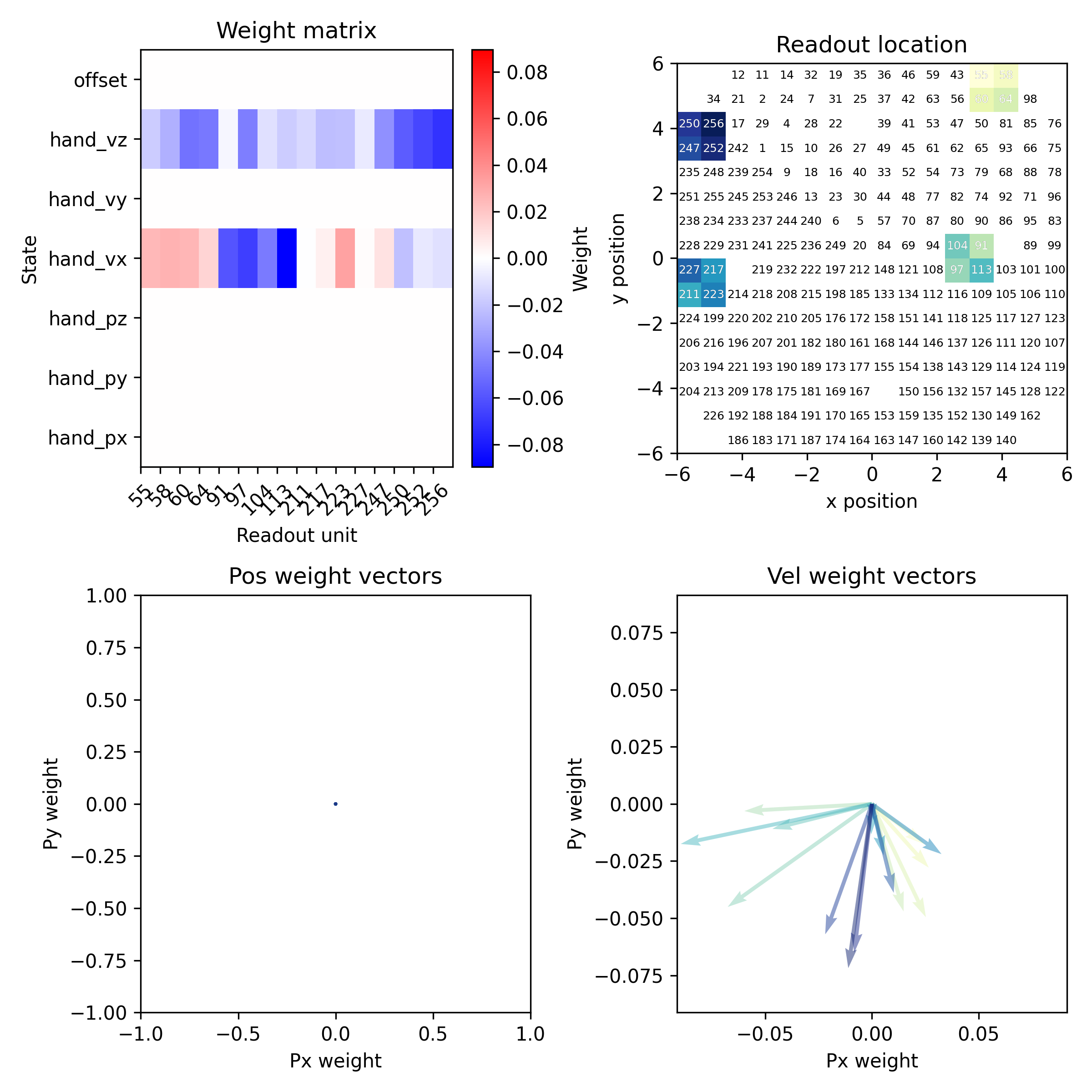
- Parameters:
decoder (riglib.bmi.Decoder) – The decoder object from BMI3D.
drive_type (str, optional) – The type of drive. See
load_chmap()for options. Defaults to ‘ECoG244’.cmap (str, optional) – The colormap to use. Defaults to ‘YlGnBu’.
- aopy.visualization.bmi3d.plot_decoder_weight_matrix(decoder, ax=None)[source]
Plot the decoder weight matrix. Compatible with Decoder objects with KFDecoder and lindecoder filters.
- Parameters:
decoder (riglib.bmi.Decoder) – The decoder object from BMI3D.
ax (matplotlib.axes.Axes, optional) – The axes on which to plot. Defaults to None.
- aopy.visualization.bmi3d.plot_decoder_weight_vectors(decoder, x_idx, y_idx, colors, ax=None)[source]
Plot decoder weight vectors.
- Parameters:
decoder (riglib.bmi.Decoder) – The decoder object from BMI3D.
x_idx (int) – The index for the x state in the decoder’s weight matrix
y_idx (int) – The index for the y state in the decoder’s weight matrix
colors (list) – List of colors for the vectors.
ax (matplotlib.axes.Axes, optional) – The axes on which to plot. Defaults to None.
- aopy.visualization.bmi3d.plot_readout_map(decoder, readouts, drive_type='ECoG244', cmap='YlGnBu', ax=None)[source]
Plot the spatial location of readouts.
- Parameters:
decoder (riglib.bmi.Decoder) – The decoder object from BMI3D.
readouts (list) – The readout channels.
drive_type (str, optional) – The type of drive. See
load_chmap()for options. Defaults to ‘ECoG244’.cmap (str, optional) – The colormap to use. Defaults to ‘YlGnBu’.
ax (matplotlib.axes.Axes, optional) – The axes on which to plot. Defaults to None.